
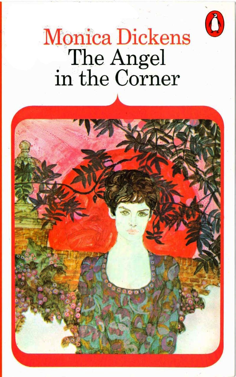
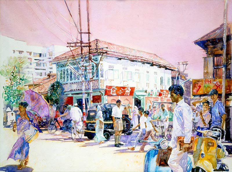
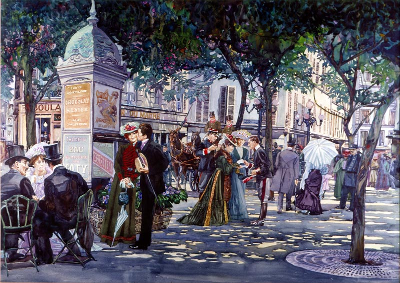
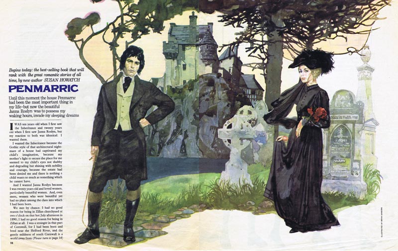
My first meeting with Brian was during the 1960s, when as art director of Woman’s Mirror, I commissioned him to illustrate a ten-part serial for the magazine. During the past year we have renewed our acquaintanceship becoming friends, and realizing that we have much history in common.
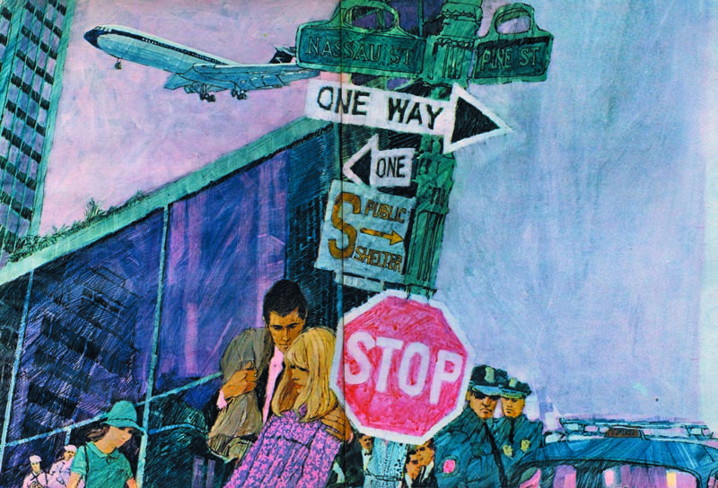
(Above: This is the first opening spread from the first commission I gave to Brian; a ten-part serial for Woman's Mirror, 1964.)
Educated at St Olave’s Grammar School, which then stood at the foot of London’s Tower Bridge, Brian spent much of his final year life drawing and painting at the Sir John Cass College of Art, less than a mile away on the other side of the river. He was offered a place at the Slade School of Art, but because of family circumstances he went to work in an advertising agency.
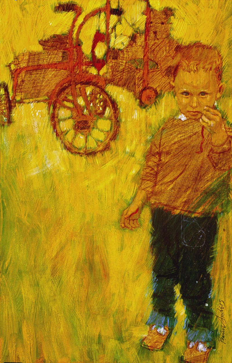
(Above: A portrait of Brian’s eldest son Mark, showing a keen interest in a worm. Always interested in and biology, now in his early 50s, he works in the radiology department of a New Zealand hospital.)
Quickly learning that most of its artwork was commissioned from two London artists’ agents, he joined one of them as a ‘gofer’. Artist Partners exposed him to sixty world-class artists and photographers and their work. He owes much to the help that many of them gave him.
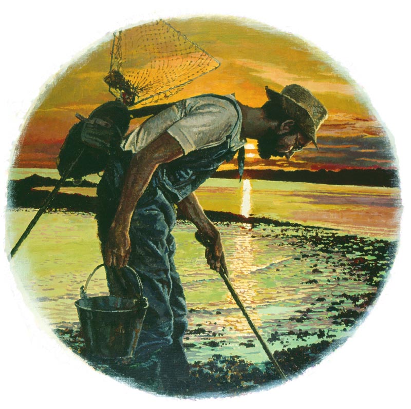
(Above: He discovered that the main subject of a composition did not necessarily have to be in the foreground.)
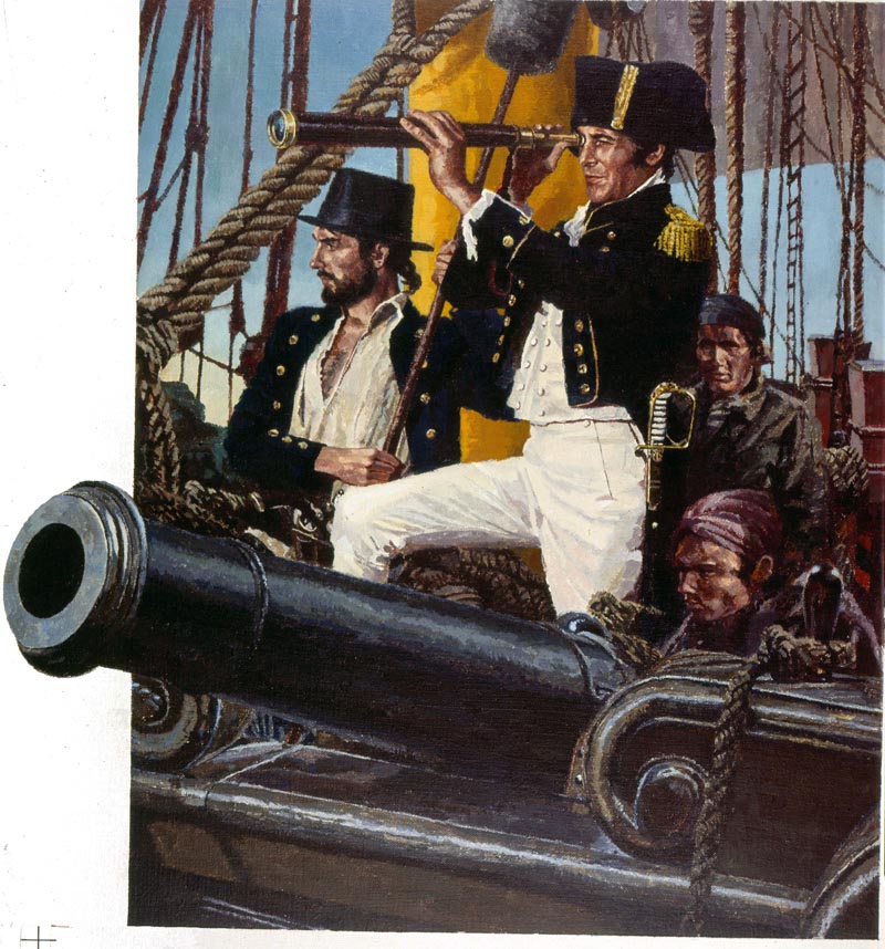
His career was interrupted by National Service with the Royal Marines, mostly spent on active service with 45 Commando in areas of North Africa and the Mediterranean. During his final year he was recruited into the Intelligence Section because of his drawing skills. After National Service he worked with photographer Adrian Flowers, to whom he is very grateful for the assistance given in helping him towards his freelance career. Brian would draw most evenings after work, and a year later he selected his best twelve pieces for a portfolio, and went freelance. Adrian provided him with a studio within his own studio in Chelsea, as a quid pro quo for background painting and visualizing.
(Above: Through experience Brian has learned that some people who might object to being photographed don’t mind being drawn.)
At first Brian represented himself, gaining work from Lilliput Magazine, which he jokingly asserts he helped to close. Miles Huddlestone at Heinemann came to his rescue supplying him with numerous book jacket commissions at seventeen guineas (£17.70) a time; so keeping the wolf from the door. Brian wishes he had kept a copy of his first jacket for the hardback edition of Ossian’s Ride by Fred Hoyle, who later became Astronomer Royal.
In 1959 Artist Partners took him onto their books and put him on the road to success.
The struggle to advance stylistically
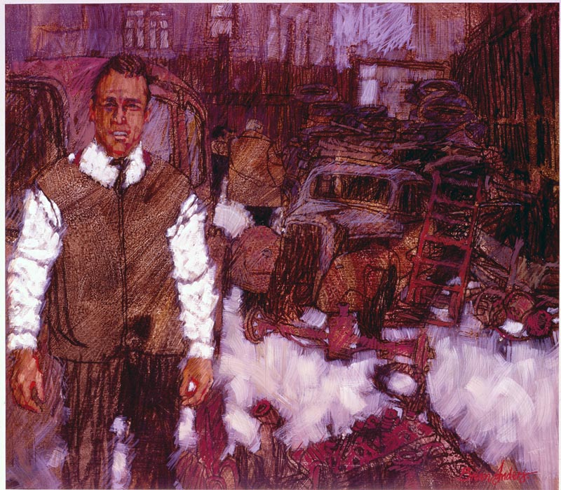
Heavily influenced by Ben Shahn and David Stone Martin he found it difficult to advance stylistically away from what they did so brilliantly. Much to his agent’s consternation he collected his samples, destroying all bar the one shown below, of him preparing ideas for his first printed Christmas card in 1959.
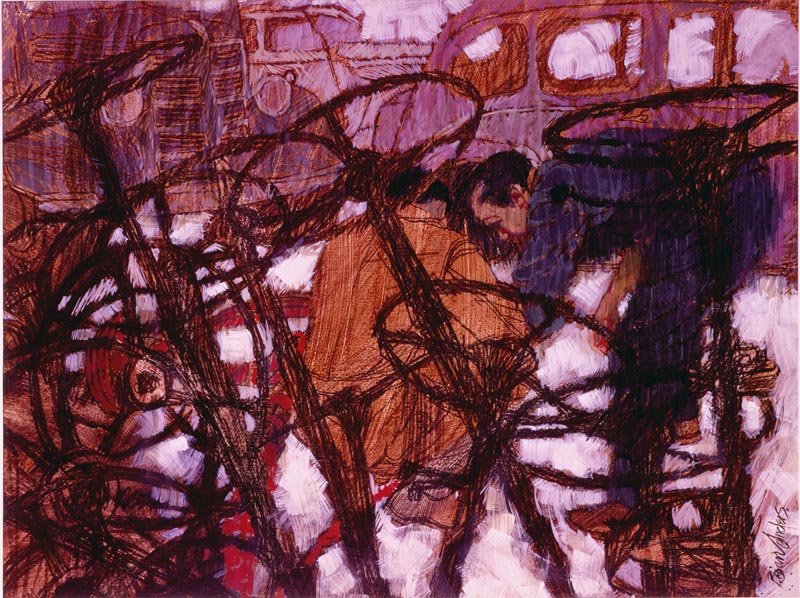
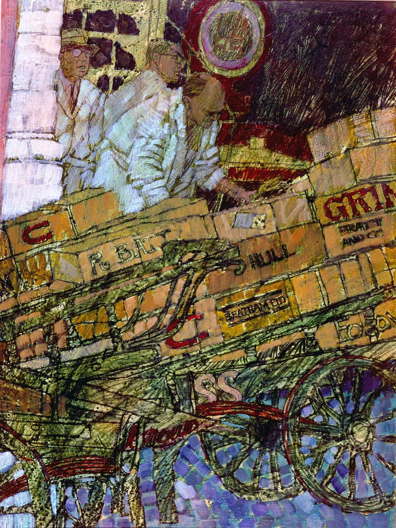
He went drawing in a breaker’s yard at the Elephant and Castle and at Billingsgate Fish Market, which was then between London and Tower Bridges – the stamping ground of his youth.
1959.
(Above: Billingsgate Fish Market. Brian’s grandfather was a wheelwright and may well have made one of these barrows.)
I always admired Joy Hannington’s work as the art editor of Homes and Gardens, in particular the way she encouraged illustrators, giving them considerable freedom to work in the way which most suited them.
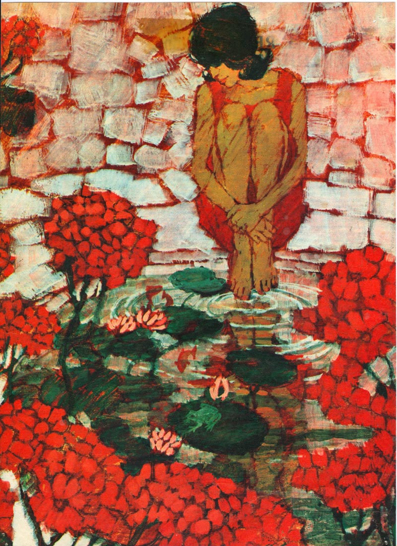
(Above: The Red Geraniums. The first piece Joy Hannington of Homes and Gardens commissioned from Brian, was a stark ‘kitchen sink’ story about two old people. This was the second.)
The earliest commissions Brian received from this ‘gutsy’ work came from Homes and Gardens, and he thanks Joy Hannington, for the confidence she showed in him, and for the opportunities that followed.

(Above: Yet again, Joy Hannington provided an opportunity to increase Brian’s subject range when she commissioned four pages of drawings of garden furniture.)
Readers Digest also began to give him work and he formed a working friendship with its art director Ken Ellis that lasted until Ken’s death forty-five years later.
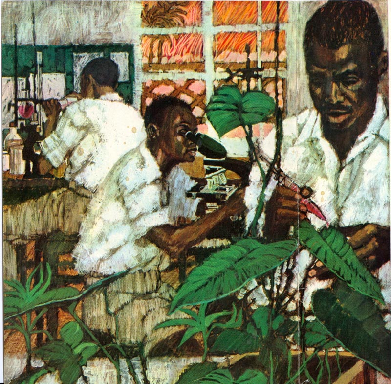 (Above: An early commission from Ken Ellis at Readers Digest. Brian had completed four covers for a Nigerian edition of the magazine, when political events caused the project to be aborted.)
Women’s magazine illustration in the early to mid-’60s
Women’s magazine illustration was at its height at this time, and most of the magazines were buying a lot of second rights material from the American greats such as Joe Bowler, Coby Whitmore and Joe de Mers. Their work had a considerable influence on the English editors, art editors, and the illustrators themselves.
By the early to mid-’60s Bernie Fuchs, Mark English, Robert Heindel and Lynn Buckham had started to replaced the earlier American stars, with Bernie Fuchs rapidly becoming the man to watch and emulate. In particular, the art directors and illustrators were fascinated with what they called the “bubble and streak” style; but we had no idea how the Americans achieved it. Brian remembers even using soap mixed with gouache in an attempt to get the paint to bubble.

(Above: In 1960, Brian was trying to imitate techniques he saw used in American magazines, without realizing that acrylic paints had been invented. This piece was drawn in pencil/charcoal on canvas paper, scumbled with coloured inks mixed with soap, and worked over in gouache.)
There was then a "eureka" moment when we discovered Liquitex acrylic colours and mediums.
(Above: Brian’s first published illustration painted in acrylics. Disappointingly for him, it was accidentally attributed to Wilson McLean, who said he did not mind. They were close friends and neighbours at the time.)
However, they weren’t on sale in the United Kingdom, but it wasn’t long before parcels of Liquitex paint and mediums were winging their way over the Atlantic, sent by friends and relatives.
(Above: An early acrylic double spread for Woman magazine. He tried whenever possible to make the location of compositions as important as the figures.)
The “Swinging Sixties”
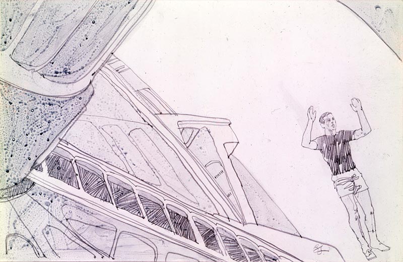
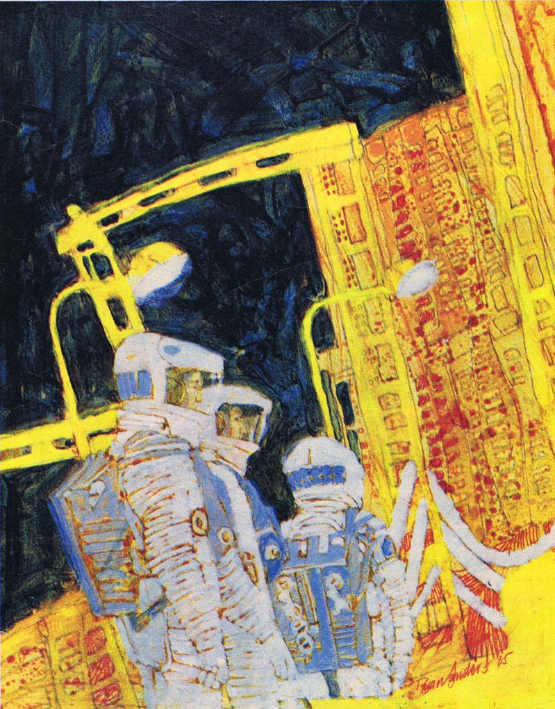
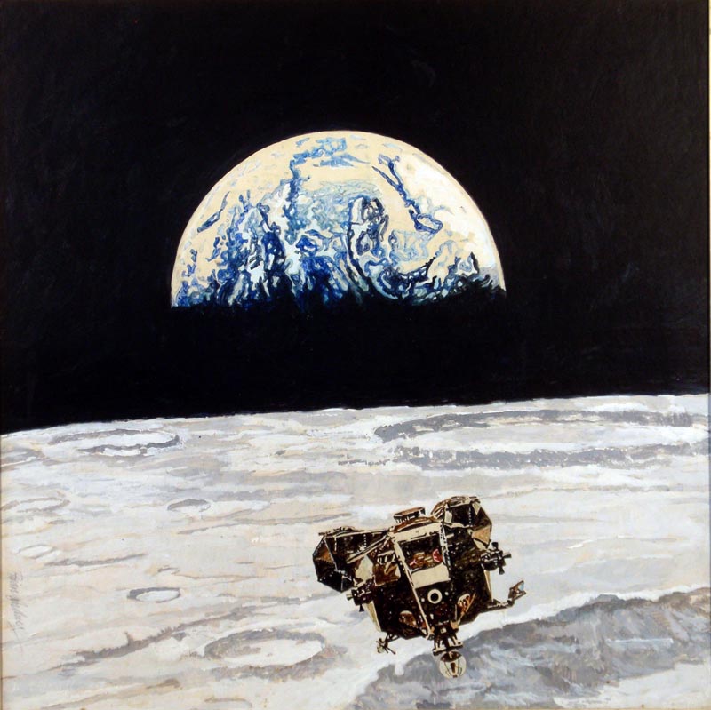
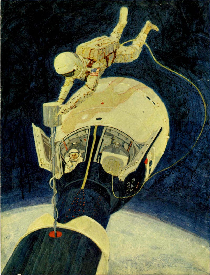
During the ’60s Brian’s work was also used in all of the earliest newspaper colour supplements, and Stanley Kubrick employed him to record with paintings and drawings made on the set, the making of 2001: A Space Odyssey.
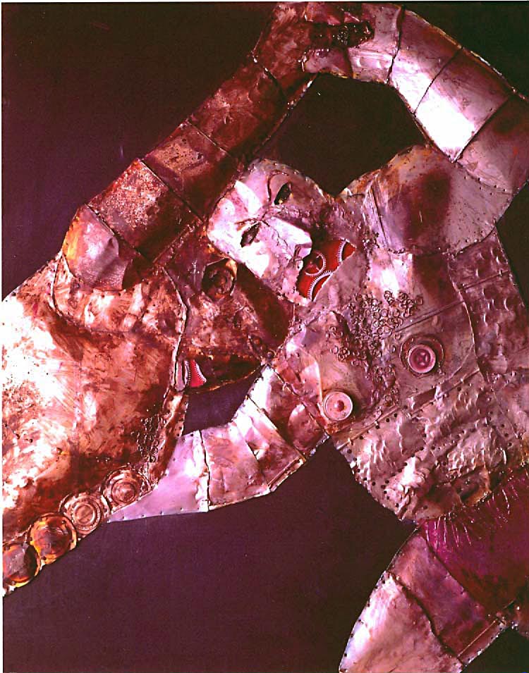
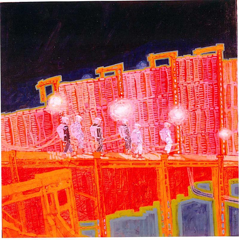
(Above: Round 65. One of a series of experimental collages that helped persuade Stanley Kubrick to offer Brian the opportunity of portraying the making of 2001: A Space Odyssey. Brian drew on the set for two days each week, working on larger paintings in his studio.)
(Above: Although he worked on the project for more than a year, he only has a record of twenty-four of his works. He thinks that there may be more in the Kubrick Archive. Only two of Brian’s drawings were published before Kubick’s death, and then not until 2001.)
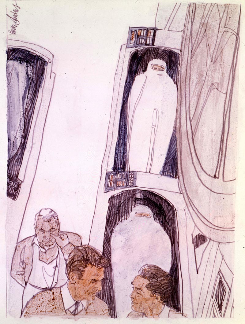 (Above: These are the cocoons the film’s astronauts would be frozen in during the journey – until Hal the computer murdered them.)
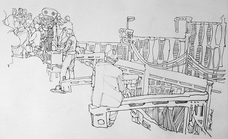
 (Above: The camera was mounted to go round with the centrifuge as the set rotated. The first time it did so, many of the exterior light bulbs exploded.)
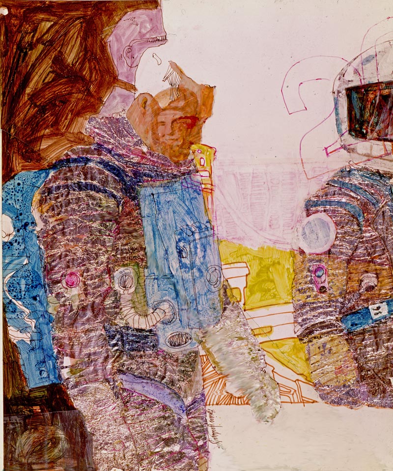
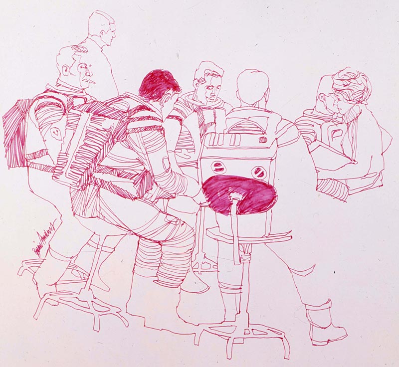
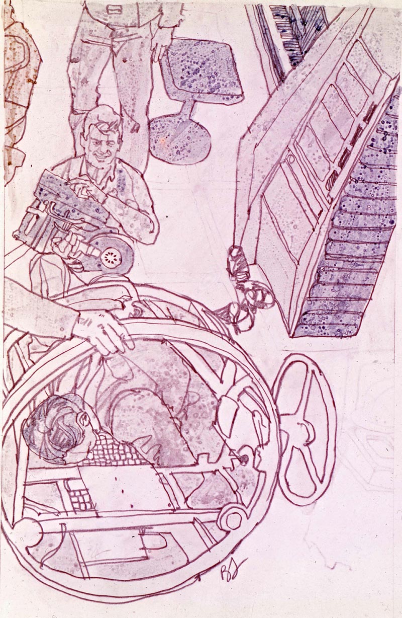
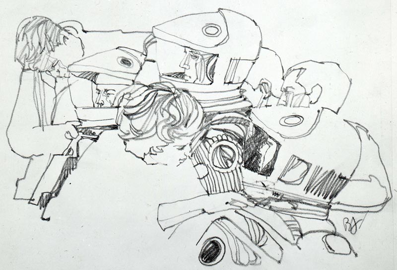 (Above: Fitting the Helmets. When in their space suits the astronaut actors breathed compressed air, just as if they were on the moon.)
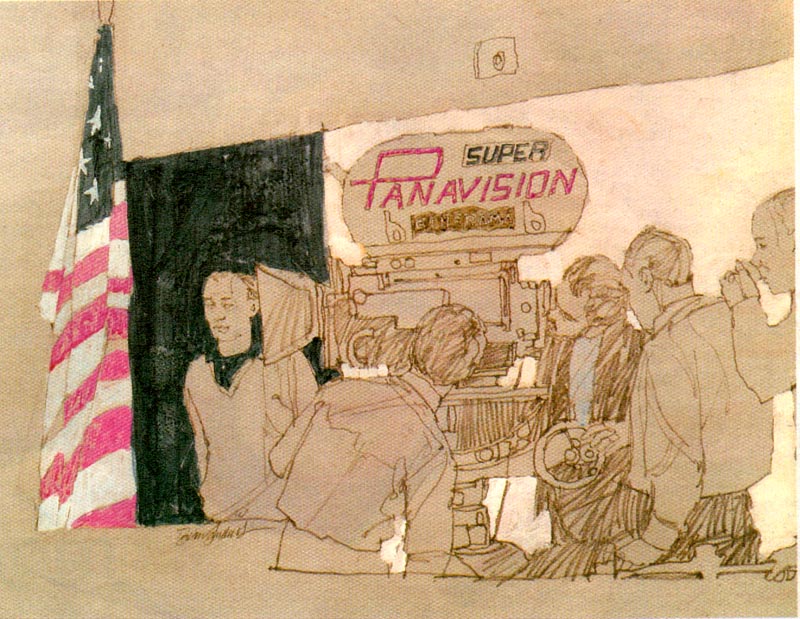
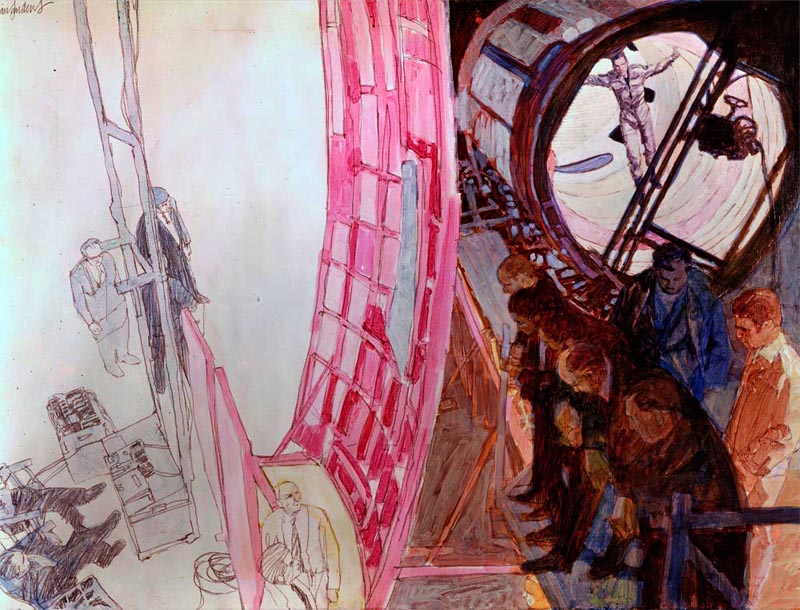 (Above: Kubrick – in blue – with the camera team. Geoff Unsworth (balding) the cameraman worked on several other Kubrick films. Keir Dullea is the astronaut in the revolving tunnel.)
It was an exciting time, and it was if someone threw a switch on the 31st of December 1959, and we were suddenly in the “Swinging Sixties”, and many of the illustrators started to develop their highly individual styles, which reflected the fashions, music and arts at the time.
(Above: The king of the Barbareens was a ten-part serial for Honey magazine. Brian made three illustrations. This opening spread was full-colour on the left, bleeding to black and white on the right hand page. The art editor then lifted parts from each illustration to illustrate further instalments. Below: The second drawing.)
However, towards the end of the ’60s there was a decline in the interest in fiction in women’s magazines, and for some reason art editors and art directors started asking the illustrators to start producing more highly finished work. Below, this Illustration for the American Good Housekeeping, was probably the last of his scumbled acrylics. His work then began to reflect the changes happening in the 1970s.
Magazine work became harder to find on both sides of the Atlantic, but the market for paperback book cover illustration remained buoyant, although more and more photographic cover illustrations were being used.
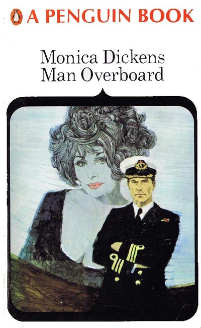 Above: Throughout his career he has been fortunate enough to illustrate hundreds of paperback covers. These are two of the earliest.
The 1970s: a challenging decade for illustrators
In common with the illustrators working in the USA, the 1970s proved to be a challenging decade for every illustrator in Britain trying to pursue a career in magazine illustration. Television stole away advertising revenue and page counts went down. There was a decline in the interest in fiction in women’s magazines, and for some reason art directors and art editors started asking the illustrators to produce more highly finished work. They also increasingly turned to photography in place of illustration.
 Above and below: 1969. Weekend Telegraph — illustrations for an article by Werner von Braun.
It was also a time of personal change for Brian. He felt that the scumbled acrylic genre (bubble and streak) illustration had run its course, and that the work of many illustrators was taking on a similar look.
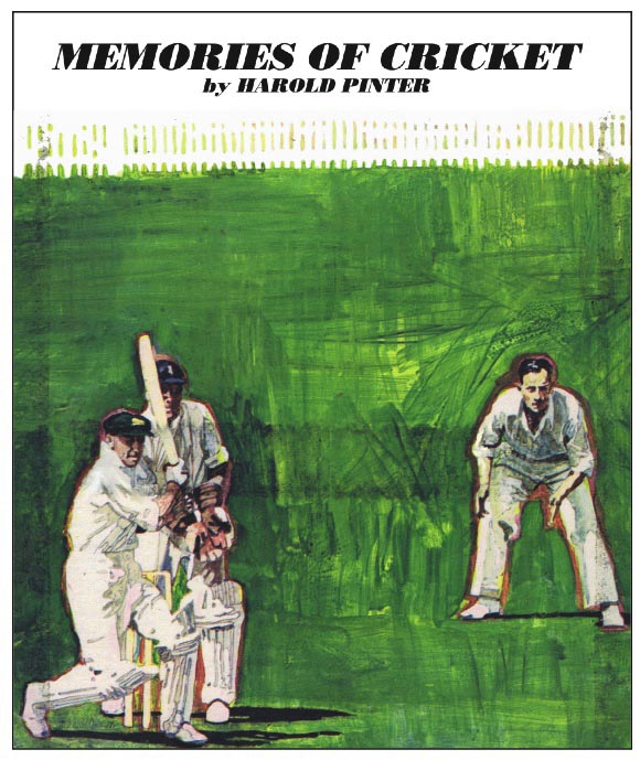 This was the last of Brian’s use of ‘bubble and streak’ (scumbled acrylic) He was surprised to discover that playwright Harold Pinter was a cricket fan.
Knowing that figurative illustration was his forte, he began working with traditional methods, beginning with watercolour as taught to him by his earliest mentor, J C Middleton who had been art master at the school he had attended as a boy.

At the beginning of the 1970s there was still a common belief in the graphics industry that watercolour was “wishy-washy” and did not reproduce well.
 Above: Sample to demonstrate that watercolour need not be “wishy-washy”. This was later used on a calendar.
Brian’s response was “You just need to charge your brush with more colour to allow for the fact that it dries a couple of tones paler than it looks when wet.”
Brian's 1970s Book Covers
The 1970s proved to be a challenging decade for every illustrator in Britain trying to pursue a career in magazine illustration.
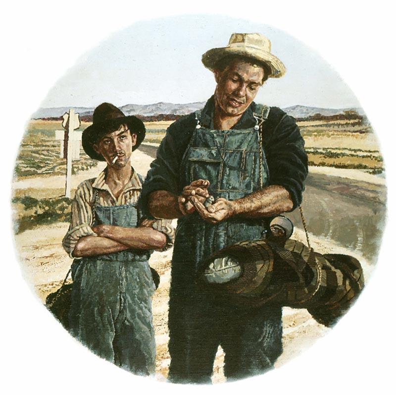
In the early seventies David Larkin, then art editor of Pan Books, asked Brian if he would like to re-jacket the Steinbeck books. They both agreed that watercolour was too English for the subject matter, so Brian said he would work in ‘acrylic solid colour’. Brian thought that there were only six books. There were twenty-six.
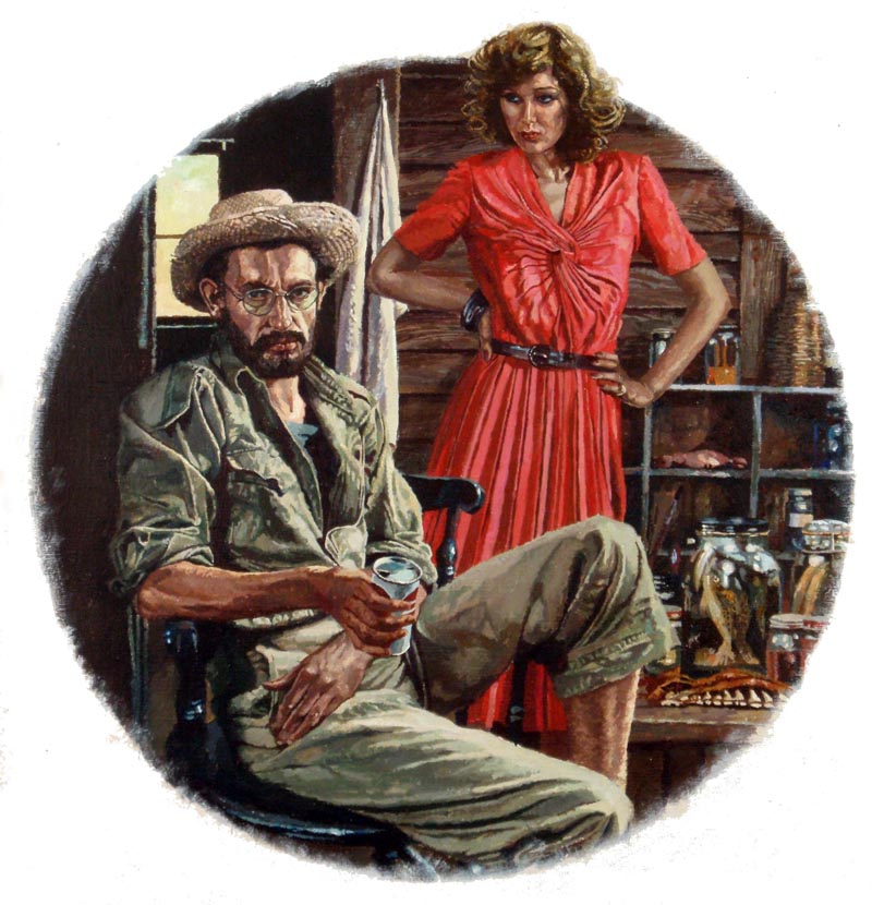
Above are Brian's illustrations for "Of Mice and Men", "The Moon is Down" and "Sweet Thursday." Below, "Log from the Sea of Cortez." The figure of Doc in these last two paintings was kindly modelled by illustrator Alan Lee, now better known as the creative director of the Lord of the Rings films
Below, cover for A Day in the Life of Ivan Denisovitch by Alexander Solzhenitsin. Published by Panther Books.

Above, one from a series of covers for books written by John Fante commissioned by Granada Books
Below, cover for a book entitled Poonah Company by Farrukh Dhondy.
Below, the cover for a book entitled It’s an Old Country by J B Priestly. Watercolour with dry brush.
Posters, Stamps and Gallery Paintings


Personal Work, Gallery and Exhibition Pieces
Below, from small to very large; the half size study for H M Queen Elizabeth’s presentation of new Standards to The Royal Tank Regiment.
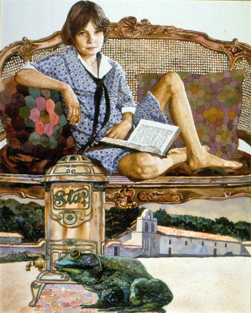
The Frog and the Water Filter. This watercolour was accepted for an Association of Illustrators annual and exhibition...

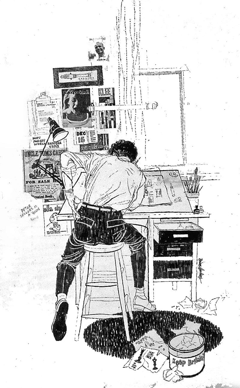
Brian has now been a professional artist for five decades during which time he has worked in every area of the illustrative arts ranging through: book publishing, magazines, advertising, government agencies, film, television and art education. He is one of the founders of the British Association of Illustrators.

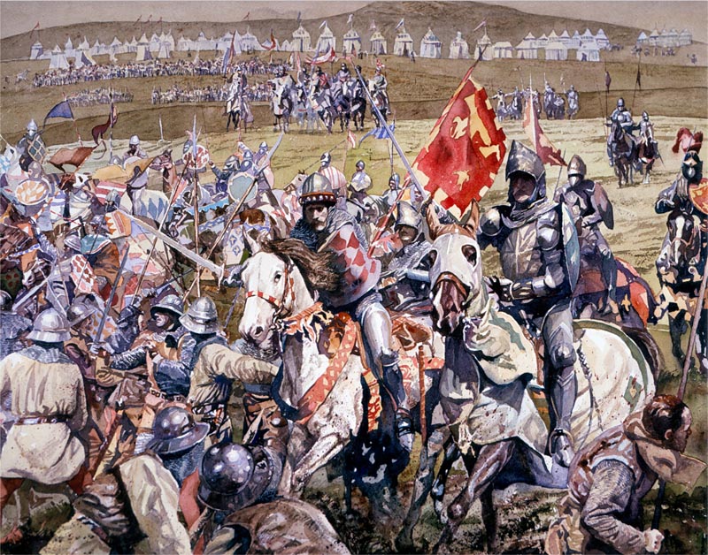
Cry God for Harry and St George - The Battle of Agincourt, watercolour for Men Only.
Stamps and Coins
The Royal Mail’s commissioning art director Stuart Rose had seen Brian’s watercolour work in several magazines, and asked to see his portfolio. Brian's first Royal Mail set: ‘Police’ was begun in 1978 and published in 1979.
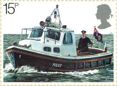
(Above: River Police Thames Patrol Launch.)
At the first meeting Brian was surprised to learn that he was expected to work only four times larger than a printed stamp, which was approximately 5 x 4 inches. Most of Brian’s work was large in scale, made to reduce to page or double spread magazine format. However, he took up the challenge, soon learning that good composition works at any size, but inevitably, at that size, the artwork becomes tighter.
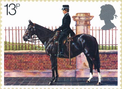
(Above: Mounted Woman Police Constable.)
Having spent several weeks researching with the police on streets, motorways and river patrols, so he could produce a series of working drawings, he nearly lost the commission at the presentation stage by declining the Metropolitan Police’s request to replace the mounted policewoman (above) with a man. His small show of feminist solidarity might well have altered his career prospects, for in those days there was always a three-way competition for each set of British stamps. However, the art director’s assistant, Barry Robinson, smoothed ruffled feathers; steered the work through the large stamp selection committee, and the set was chosen. Their working friendship lasted over the years until Barry retired.
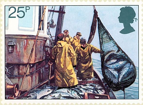
For his second set featuring ‘The Fishing Industry’ in 1981, Brian toured the coast of Britain where he discovered an industry in decline, but met many entertaining characters, particularly in north west Scotland.
(Above: Scottish Crab and Lobster Fishing, below: Seine Netting)
Brian thinks that his third set illustrating ‘Youth Movements’, made in 1982, was the first time he designed four stamps that worked well as a set.
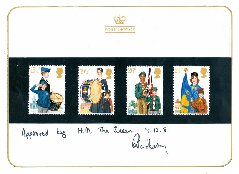
(Above: Essays approved by HM Queen, below: Girls Life Brigade original art work)
His fourth set for the ‘British Council’ which he produced in 1984, was designed by the Newell and Sorrel Design Group, with Brian executing the final artwork.
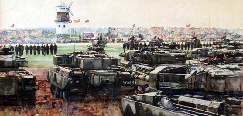
In 1985, Brian went from the miniature to making a watercolour of HM Queen’s presentation of new standards to the Royal Tank Regiment then stationed in West Germany, which measured six feet by four feet.
(Below: the half size study of that painting, previously featured on Today’s Inspiration in December 2011)
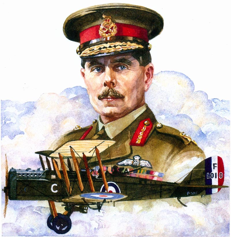
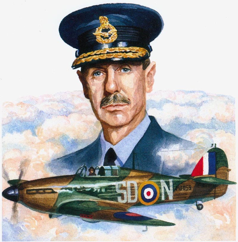
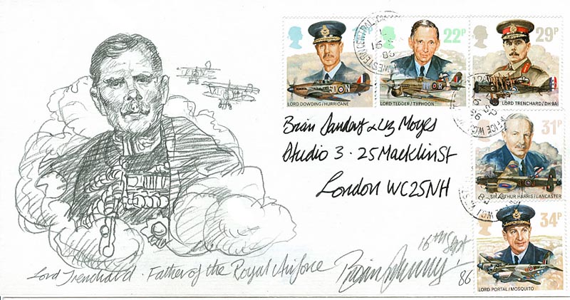
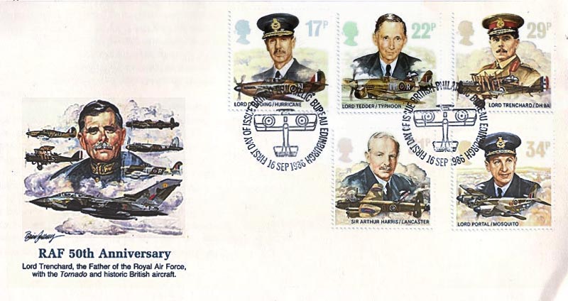
In the same year he prepared in small scale ‘The Royal Air Force’ stamps, which were published in 1986.
(Above: original art of Lord Trenchard founder of The Royal Air Force. Below: Air Marshal Lord Dowding Chief of the Air Staff Fighter Command during the Battle of Britain)
(Below: Air Marshal Lord Tedder with Typhoon Fighter Bomber)
"Stamps here in the UK were very well paid," says Brian. "We were paid by the Post Office to produce the presentation set in competition and if it was accepted the fee doubled. It was certainly much better paid than editorial illustration."
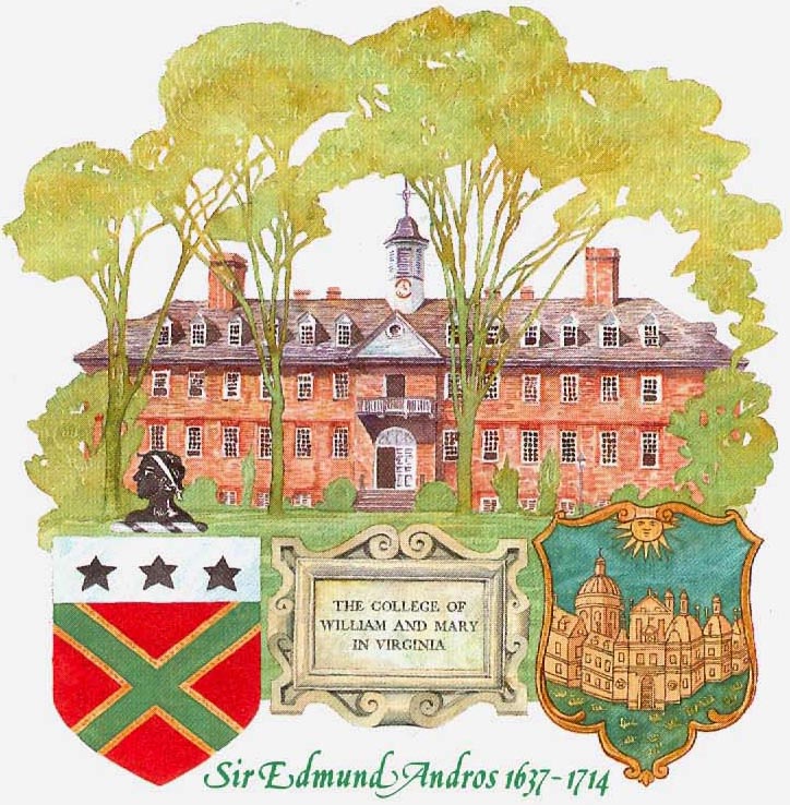
1987 saw the publication of a set for Guernsey Post Office (below) featuring Guernsey born Sir Edmund Andros, who later became Governor of Virginia, Boston, and New Amsterdam—before it was renamed New York.
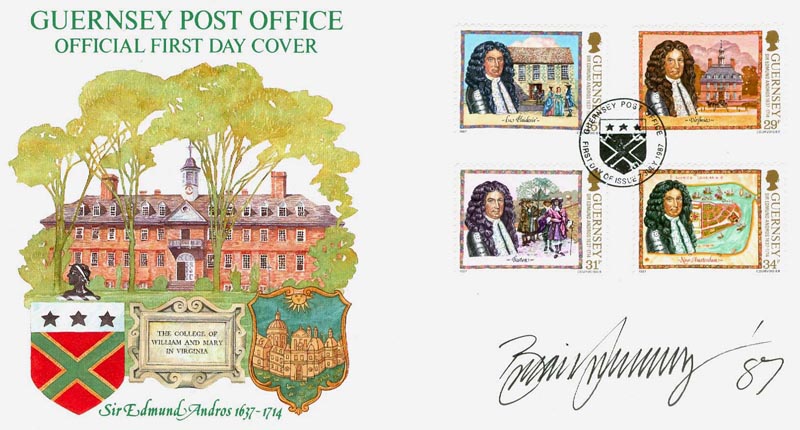
"I was never given another project from Guernsey," says Brian. "I had dared tell another Illustrator (Eric Stemp) how much I had been paid. He rang the client to ask why he had received less."
He continues, "The early stamp commissions came at a time when there was no shortage of work for me in other areas such as magazine illustration, packaging and book jackets, which is why I wasn't really worried about losing the Guernsey commission. I have never suffered insecurities felt by many illustrators, as I have never not had work. This is because over the years I continually experimented or changed in an attempt to do the sort of work I wished to."
Brian says, "Having Unicover USA ask me to design first day covers to my British stamps was a big surprise. The covers (one example below) paid the same as a British stamp."
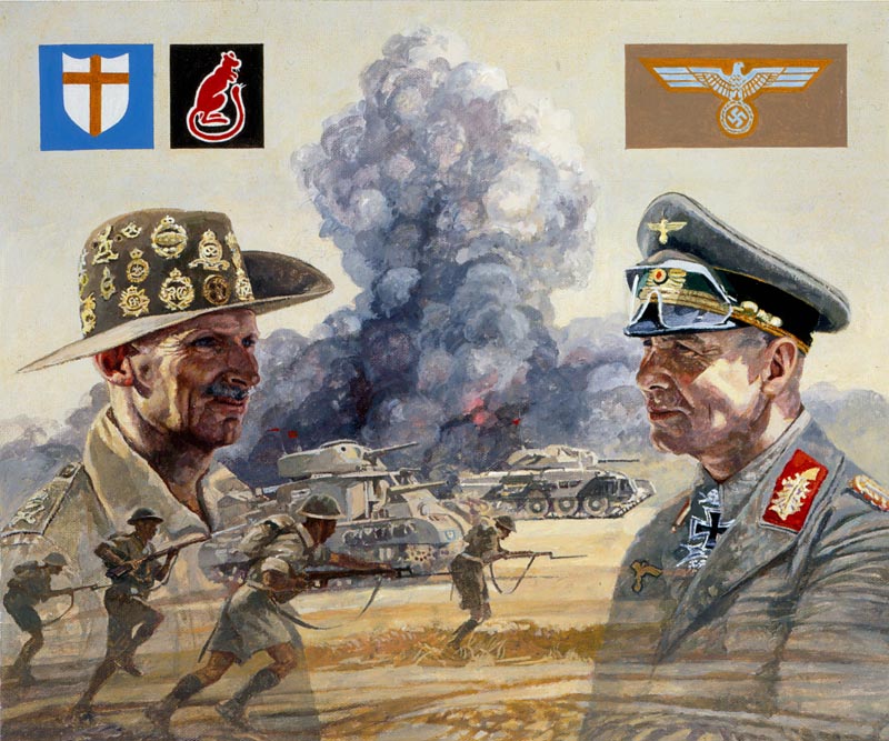
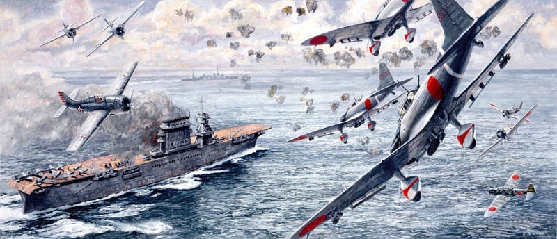
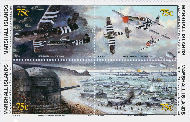
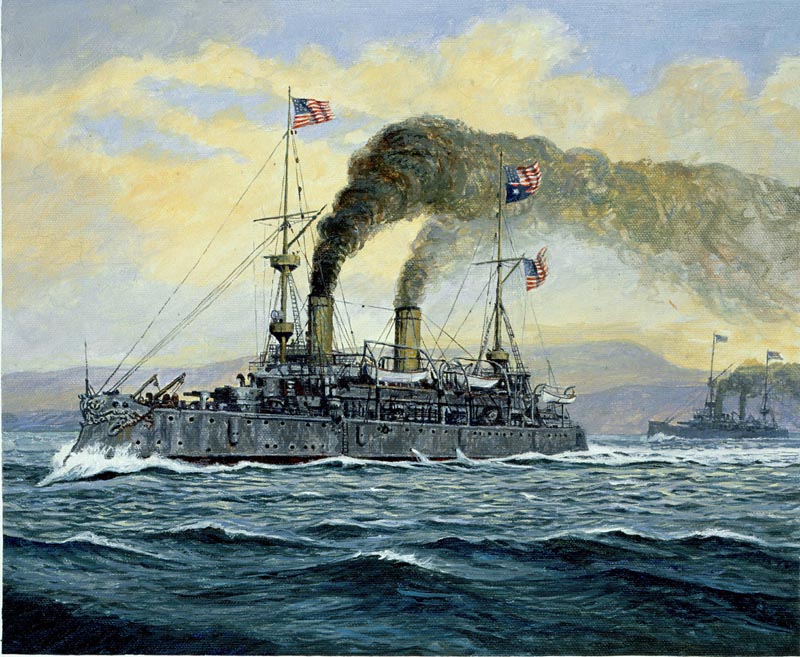
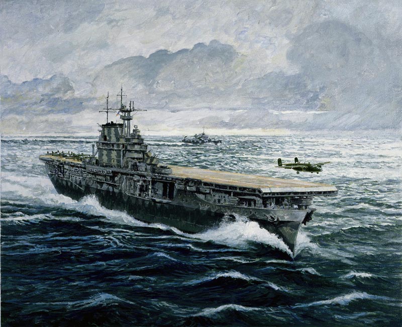
Having made first day cover cachets to all of his Royal Mail stamps for Unicover USA, the corporation went on to commission Brian in 1988 to work on a fifty-year anniversary project ‘The History of World War 2 in Postage Stamps’.

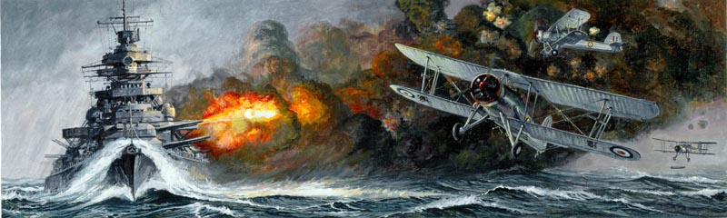
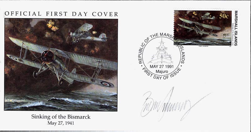
It was a massive undertaking, spread over five years, and involved eight other artists.
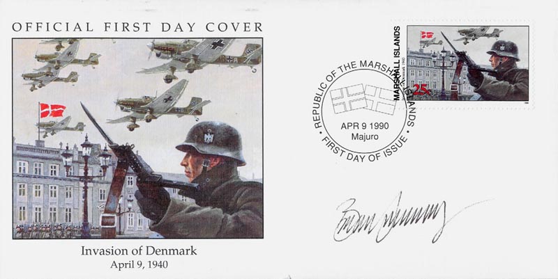
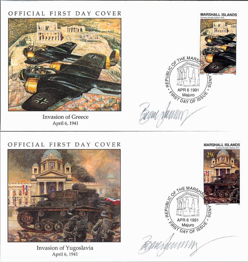
Of the one hundred issues, Brian executed thirty-nine sets, which finally totalled eighty-two stamps.
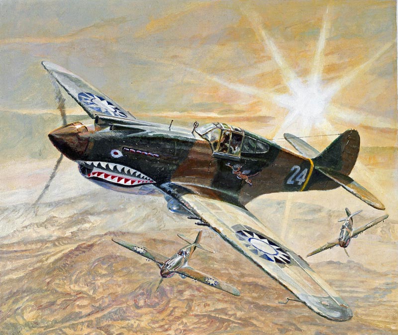
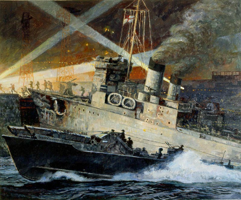
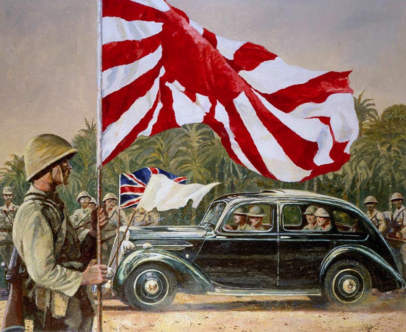
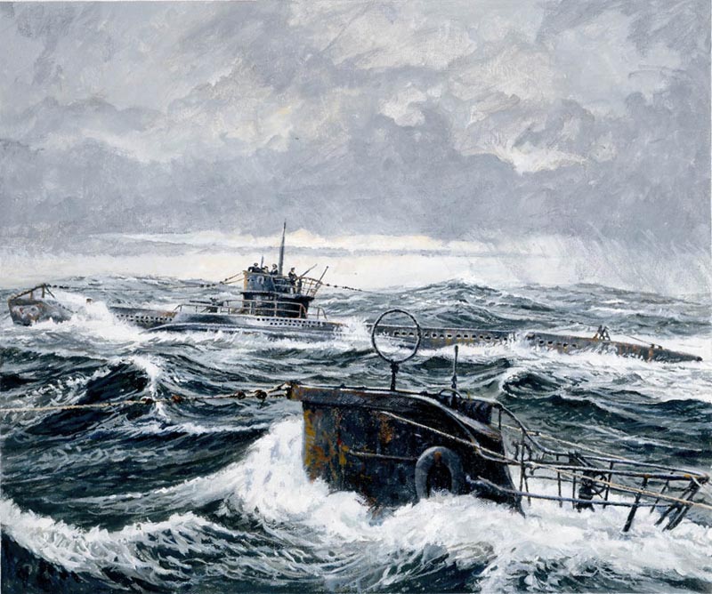

Each artwork was designed to include not only the stamp format, but the square shape of a 1st day cover cachet for each stamp. This complicated the design, as some stamps were printed in pairs...
... or fours.
"I only ever given one change from Unicover," says Brian, "and that was to show The Admiral Graf Spey un-sunk. They paid me to redo it. All of the content other than the subject matter was left to me. The ideal client."
Later his artwork was exhibited at The Imperial War Museum Cambridge in eastern England.

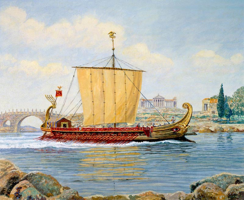
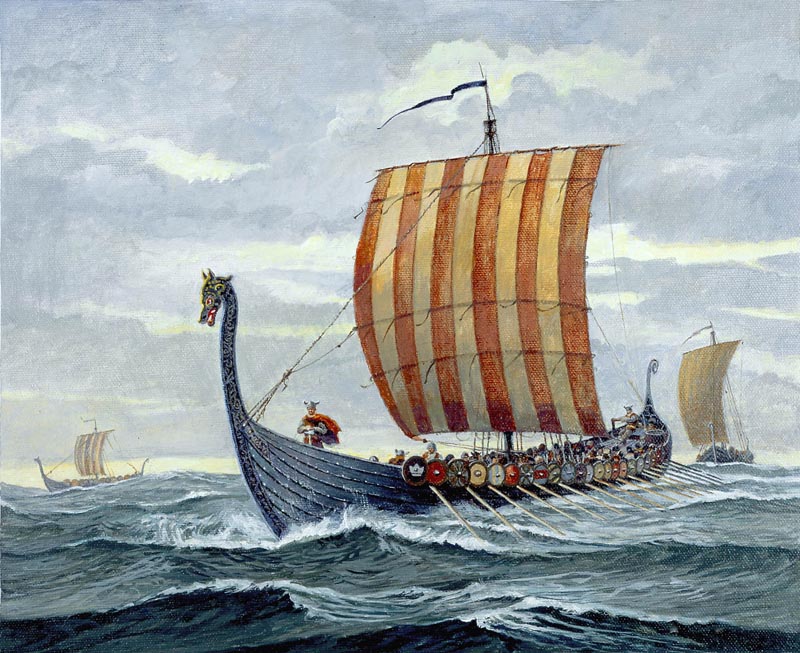
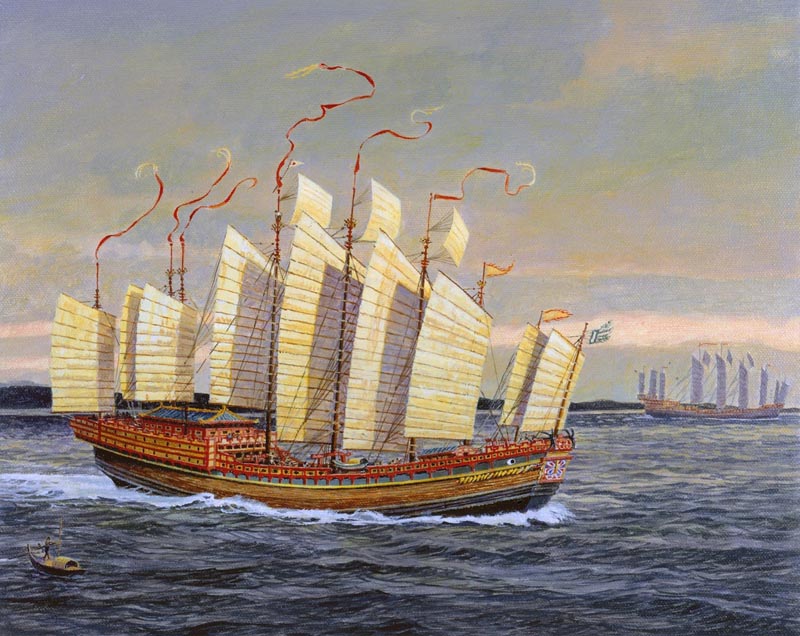
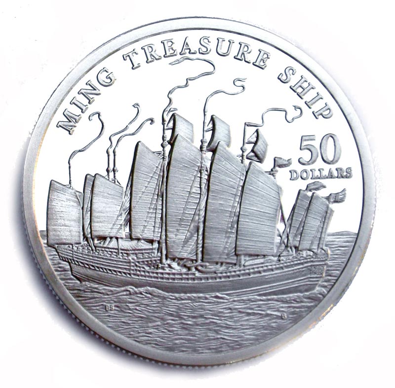
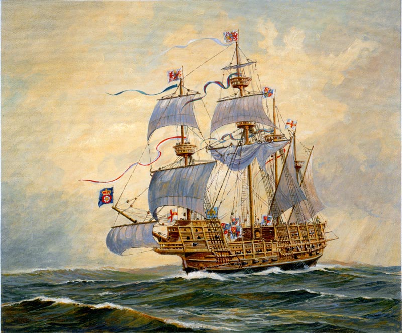
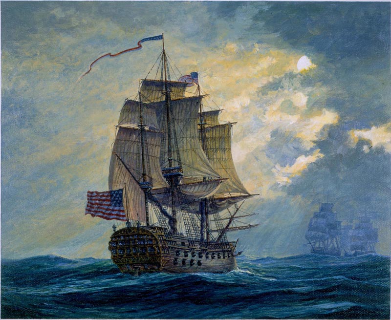
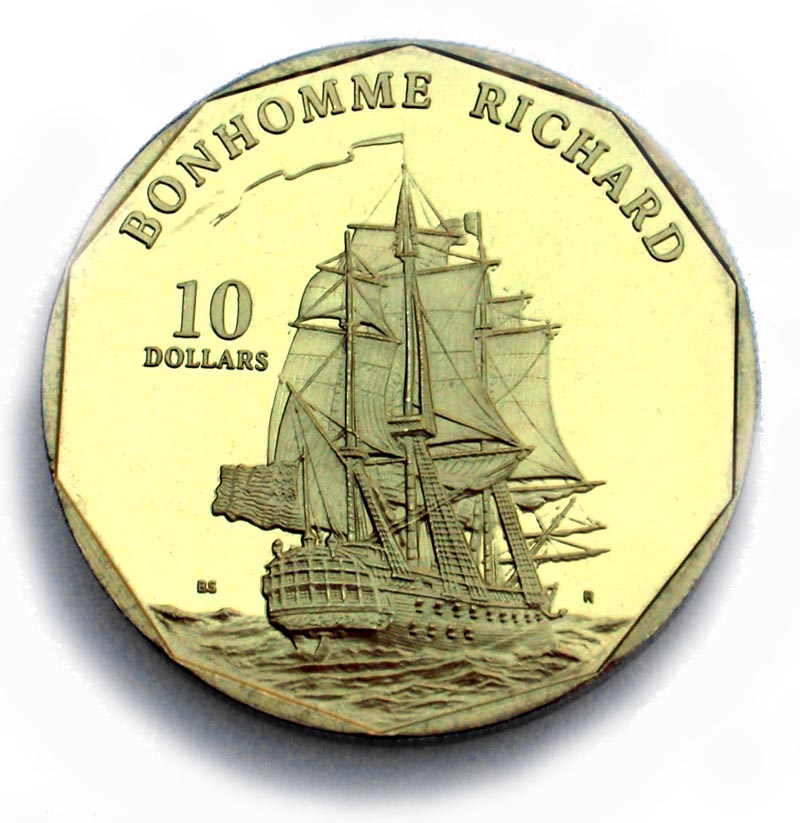
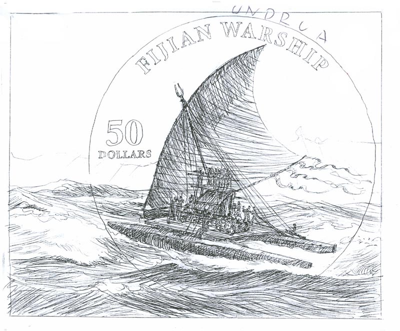
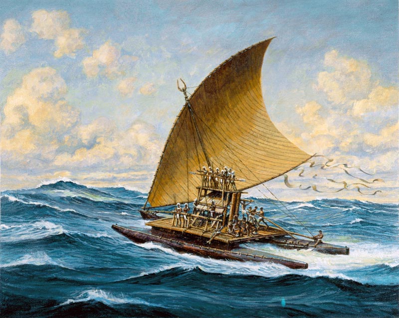
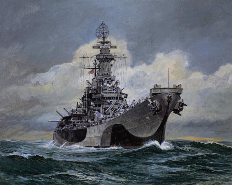
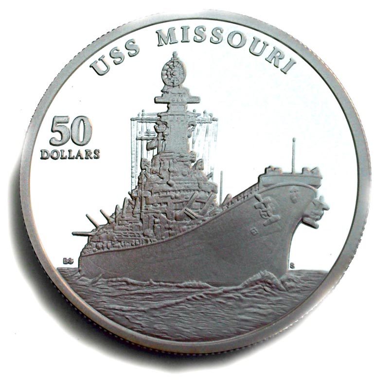
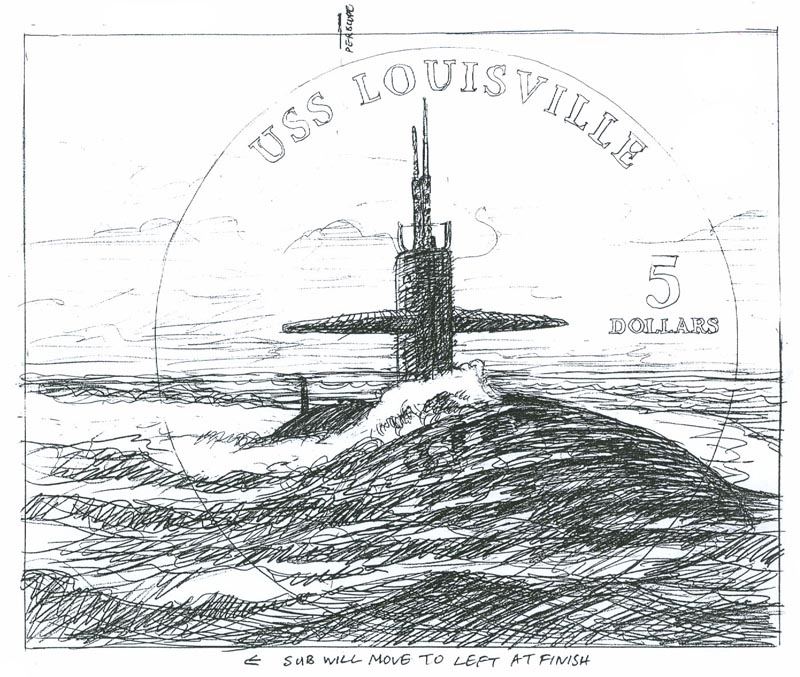
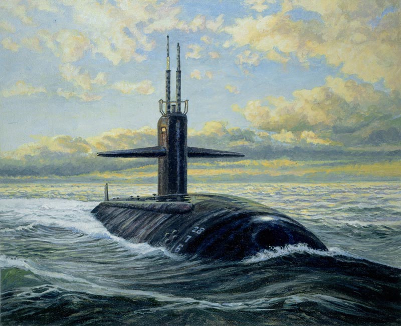
During 1997and 1998 Brian designed a further twenty-six stamps and thirty-two coins for the Marshal Islands commissioned by Unicover on the subject of ‘Legendary Fighting Ships’. Eight coins were minted as a separate set entitled ‘Legendary Fighting Ships of the US Navy’.
Regarding the obviously substantial amount of research involved in preparing for an undertaking like yesterday's 'History of WWII' or today's 'Legendary Fighting Ships', Brian says, "In the case of WW2, I knew the itinerary for the year ahead and so was able to plan for the research, which was the most time consuming part, as it was pre-online and involved traveling to the various museums."
"Once I had made good contacts at places such as The Imperial War Museum, Greenwich Maritime Museum, The Fleet Air Arm Museum etc; things speeded up. The RAF Museum had already been most helpful because of the earlier stamps and having those under my belt opened other doors more easily. Not all academics are generous with their time."
To receive a commission for the design of a coin is a rare privilege most illustrators will never experience. When asked how it felt to receive such a commission - and then to actually hold the physical manifestation of that design, rendered in shining metal, Brian says, "It felt great on both counts. The first of the $50 silver proof coins were sent by airmail. The postman used to come very early in the morning in those days and so as not to disturb us left them on the doorstep!"
Brian feels he was well inclined to the subject matter of ‘Legendary Fighting Ships’. "The military and maritime section of our library (my wife, Lizzie is also an illustrator although currently reading for a masters in history at Kings College) is somewhat top heavy."
Regarding his masterful rendering of the ocean, in all it's seemingly endless permutations, Brian says, "We all learn from others and there are plenty of better painters of the sea than myself, from the 18th century forwards. I suppose that if I had to pick one, it would be Thomas Somerscales."
"I have always been a water watcher though," says Brian.
He continues, "National Service as a Royal Marines Commando gave me opportunities to view it close up from canoes...
"... and landing craft... "
" ...or the bigger ships such as aircraft carriers."
"The seascape from the decks of assault ships HMS Reggio and Striker in gale force winds remains with me to this day."
Brian says, "I have had many comments of interest from collectors, mostly favourable - some peculiar. E.G. A Dutch collector collected only stamps with Windmills on them and wasn't sure, because of the size, whether the Brederode stamp/coin had one. I was able to reassure him there were at least two."
"Another gentleman queried the layout of Missouri's armament. Details from 'The U.S.S. Missouri' - a wonderful book about the ship written by her Master at Arms - proved the point."
One wonders if such massive illustration projects leave room for other commissions. In his case, Brian says, "I did manage a couple of other small commissions, but soon found that the Unicover projects were sufficient to handle and stopped accepting other work."
Does Brian consider his stamp and coin series to be the highlight of his long and storied career? "No," says the artist, "but working with Kubrick, the colour supplements of 'The Sunday Times', Telegraph' and 'Observer' gave great pleasure and a super shop window. Publication in 'Nova' magazine was a memorable pinnacle."
"Stamps opened new doors."
In 2005, The Marshal Islands also re-issued ‘Historic Fighting Ships’, and two sets from the World War 2 series.*
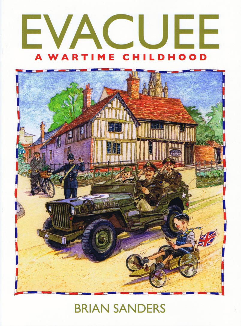
His most recently published book is: Evacuee: A Wartime Childhood, the first in a biographic trilogy. It quotes him as saying; “I always wanted to be an artist and I’m still trying”.
* ALL MARSHAL ISLANDS'MATERIAL SHOWN IS © COPYRIGHT TO UNICOVER CORPORATION USA.
Educated at St Olave’s Grammar School, which then stood at the foot of London’s Tower Bridge, Brian spent much of his final year life drawing and painting at the Sir John Cass College of Art, less than a mile away on the other side of the river. He was offered a place at the Slade School of Art, but because of family circumstances he went to work in an advertising agency.
Quickly learning that most of its artwork was commissioned from two London artists’ agents, he joined one of them as a ‘gofer’. Artist Partners exposed him to sixty world-class artists and photographers and their work. He owes much to the help that many of them gave him.
His career was interrupted by National Service with the Royal Marines, mostly spent on active service with 45 Commando in areas of North Africa and the Mediterranean. During his final year he was recruited into the Intelligence Section because of his drawing skills. After National Service he worked with photographer Adrian Flowers, to whom he is very grateful for the assistance given in helping him towards his freelance career. Brian would draw most evenings after work, and a year later he selected his best twelve pieces for a portfolio, and went freelance. Adrian provided him with a studio within his own studio in Chelsea, as a quid pro quo for background painting and visualizing.
At first Brian represented himself, gaining work from Lilliput Magazine, which he jokingly asserts he helped to close. Miles Huddlestone at Heinemann came to his rescue supplying him with numerous book jacket commissions at seventeen guineas (£17.70) a time; so keeping the wolf from the door. Brian wishes he had kept a copy of his first jacket for the hardback edition of Ossian’s Ride by Fred Hoyle, who later became Astronomer Royal.
In 1959 Artist Partners took him onto their books and put him on the road to success.
The struggle to advance stylistically
Heavily influenced by Ben Shahn and David Stone Martin he found it difficult to advance stylistically away from what they did so brilliantly. Much to his agent’s consternation he collected his samples, destroying all bar the one shown below, of him preparing ideas for his first printed Christmas card in 1959.
(Above: Billingsgate Fish Market. Brian’s grandfather was a wheelwright and may well have made one of these barrows.)
I always admired Joy Hannington’s work as the art editor of Homes and Gardens, in particular the way she encouraged illustrators, giving them considerable freedom to work in the way which most suited them.
The earliest commissions Brian received from this ‘gutsy’ work came from Homes and Gardens, and he thanks Joy Hannington, for the confidence she showed in him, and for the opportunities that followed.
(Above: Joy Hannington had been expecting a horizontal half page but didn’t complain when Brian delivered this vertical illustration.)
Readers Digest also began to give him work and he formed a working friendship with its art director Ken Ellis that lasted until Ken’s death forty-five years later.
Women’s magazine illustration in the early to mid-’60s
Women’s magazine illustration was at its height at this time, and most of the magazines were buying a lot of second rights material from the American greats such as Joe Bowler, Coby Whitmore and Joe de Mers. Their work had a considerable influence on the English editors, art editors, and the illustrators themselves.
(Above: The final illustration that Brian produced using ink and gouache.)
By the early to mid-’60s Bernie Fuchs, Mark English, Robert Heindel and Lynn Buckham had started to replaced the earlier American stars, with Bernie Fuchs rapidly becoming the man to watch and emulate. In particular, the art directors and illustrators were fascinated with what they called the “bubble and streak” style; but we had no idea how the Americans achieved it. Brian remembers even using soap mixed with gouache in an attempt to get the paint to bubble.
(Above: In 1960, Brian was trying to imitate techniques he saw used in American magazines, without realizing that acrylic paints had been invented. This piece was drawn in pencil/charcoal on canvas paper, scumbled with coloured inks mixed with soap, and worked over in gouache.)
There was then a "eureka" moment when we discovered Liquitex acrylic colours and mediums.
However, they weren’t on sale in the United Kingdom, but it wasn’t long before parcels of Liquitex paint and mediums were winging their way over the Atlantic, sent by friends and relatives.
(Above: An early acrylic double spread for Woman magazine. He tried whenever possible to make the location of compositions as important as the figures.)
The “Swinging Sixties”
During the ’60s Brian’s work was also used in all of the earliest newspaper colour supplements, and Stanley Kubrick employed him to record with paintings and drawings made on the set, the making of 2001: A Space Odyssey.
(Above: Collage of the Astronauts’ costumes.)
(Above: Preparing to shoot the descent into the pit containing the obelisk.)
(Above: This painting/collage was on a canvas four feet square.)
(Above: It was amusing to see the astronaut actors smoking and playing poker whilst awaiting their cue.)
(Above: Kubrick rightly thought that suits and uniforms would change little over the years.)
(Above: Gary Powers rehearsing. He ran on the spot whilst the huge centrifuge set rotated.)
(Above: One of the only two pieces published before the film was released.)
It was an exciting time, and it was if someone threw a switch on the 31st of December 1959, and we were suddenly in the “Swinging Sixties”, and many of the illustrators started to develop their highly individual styles, which reflected the fashions, music and arts at the time.
The 1970s: a challenging decade for illustrators
In common with the illustrators working in the USA, the 1970s proved to be a challenging decade for every illustrator in Britain trying to pursue a career in magazine illustration. Television stole away advertising revenue and page counts went down. There was a decline in the interest in fiction in women’s magazines, and for some reason art directors and art editors started asking the illustrators to produce more highly finished work. They also increasingly turned to photography in place of illustration.
Knowing that figurative illustration was his forte, he began working with traditional methods, beginning with watercolour as taught to him by his earliest mentor, J C Middleton who had been art master at the school he had attended as a boy.
Changing style: Woman's Realm 1970. This was one of his earliest published watercolours.
At the beginning of the 1970s there was still a common belief in the graphics industry that watercolour was “wishy-washy” and did not reproduce well.
Brian’s response was “You just need to charge your brush with more colour to allow for the fact that it dries a couple of tones paler than it looks when wet.”
Double page spread for Woman’s Own.
Brian's 1970s Book Covers
The 1970s proved to be a challenging decade for every illustrator in Britain trying to pursue a career in magazine illustration.
However, the market for paperback book cover illustration remained buoyant, although more and more photographic cover illustrations were being used.
In the early seventies David Larkin, then art editor of Pan Books, asked Brian if he would like to re-jacket the Steinbeck books. They both agreed that watercolour was too English for the subject matter, so Brian said he would work in ‘acrylic solid colour’. Brian thought that there were only six books. There were twenty-six.
Above are Brian's illustrations for "Of Mice and Men", "The Moon is Down" and "Sweet Thursday." Below, "Log from the Sea of Cortez." The figure of Doc in these last two paintings was kindly modelled by illustrator Alan Lee, now better known as the creative director of the Lord of the Rings films
Below, book cover for Heat and Dust by Ruth Prawer Jabwallah.
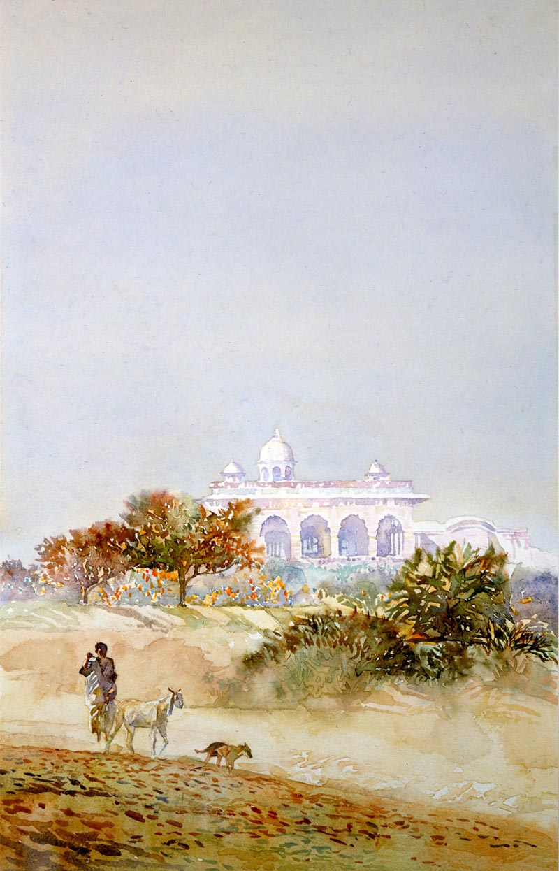
A Stronger Climate. The main building on this cover was not in India but based on the view from the roof above Brian’s studio at Artist Partners in London’s Soho. It is actually the Windmill Theatre.
Below, cover for A Day in the Life of Ivan Denisovitch by Alexander Solzhenitsin. Published by Panther Books.
Above, one from a series of covers for books written by John Fante commissioned by Granada Books
Below, cover for a book entitled Poonah Company by Farrukh Dhondy.
Below, the cover for a book entitled It’s an Old Country by J B Priestly. Watercolour with dry brush.
The model Brian chose to play the part of the aging private detective in the novel turned out to be one!
Two covers for Brian Moore novels. Above: The Emperor of Ice CreamBelow: The Luck of Ginger Coffey
Brian re-jacketed several C S Forester books for David Larkin at Pan.
This was for Hornblower in the West Indies
Since the early seventies, Brian’s work has encompassed formats from book covers and magazine illustration to large-scale posters and military paintings.
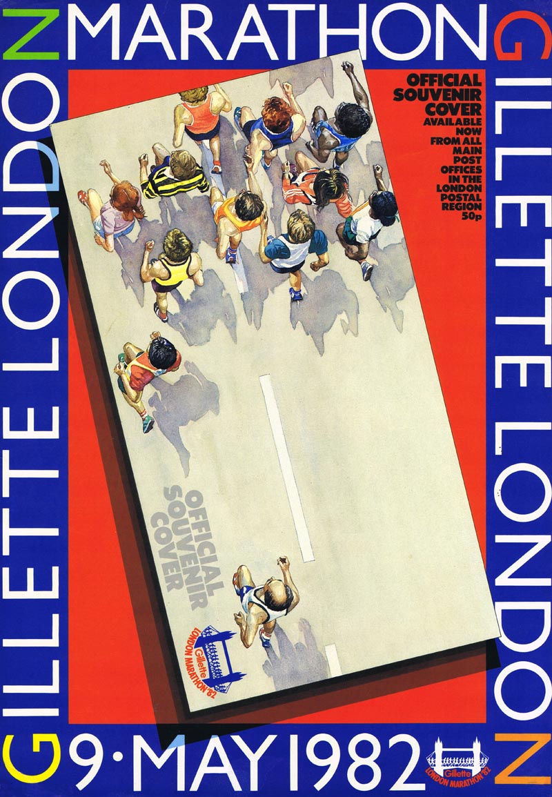
Above, a poster advertising the Official Royal Mail Souvenir Cover to a Commemorative Stamp for the London Marathon in 1982. Below, two of a set of four stamps featuring British Police. Brian nearly lost the commission when he refused to replace the mounted policewoman with a policeman.
Below, two illustrations from a set of five stamps commemorating Marshals of the Royal Air Force. This first one is of Lord Trenchard, founder of The Royal Air Force...
... and this second one is Air Marshal Lord Dowding, Chief of the Air Staff Fighter Command during the Battle of Britain.
Above: Rose d’Angou: one of a set twelve wine labels
Above: From a series of packaging projects for Reckit and Coleman.
Above: Packaging for Coty Products. 12 different packs were designed from this artwork.
Brian has exhibited widely in mixed exhibitions, and one man shows have been held at The Imperial War Museum, York Castle Museum, The Association of Illustrators’ Gallery, National Trust Gallery at Trelissic, Cornwall, and The Sir Rowland Hill Museum.
Below, from small to very large; the half size study for H M Queen Elizabeth’s presentation of new Standards to The Royal Tank Regiment.
The final watercolour was over six feet wide and was accepted for exhibition by the Royal Academy in London.
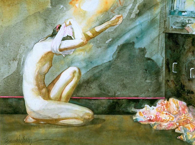
The Frog and the Water Filter. This watercolour was accepted for an Association of Illustrators annual and exhibition...
... but vanished from the Woman’s Own offices before it could be shown.
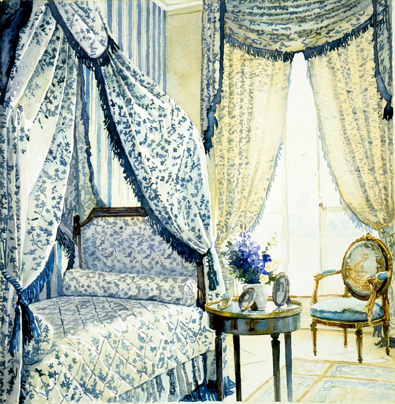
Below, a bedroom in designer Laura Ashley’s house.
An exhibition of Brian’s personal watercolours was held at the Association of Illustrators Gallery in London in 1983.
Above: Mirror Mirror Below: Live Edge
Throughout his career, Brian has made many works purely for his own satisfaction.
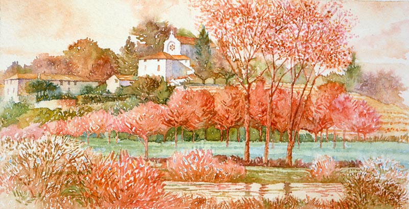
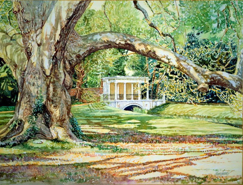
Above is the Elysian Garden of Audley End House, which is close to where he now lives.
Brian has now been a professional artist for five decades during which time he has worked in every area of the illustrative arts ranging through: book publishing, magazines, advertising, government agencies, film, television and art education. He is one of the founders of the British Association of Illustrators.
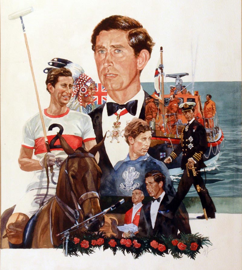
Below: HRH Prince Charles for Woman’s Own
Below: Serial opening for Woman magazine.
Above and below: two more opening spreads for Woman’s Own serials.
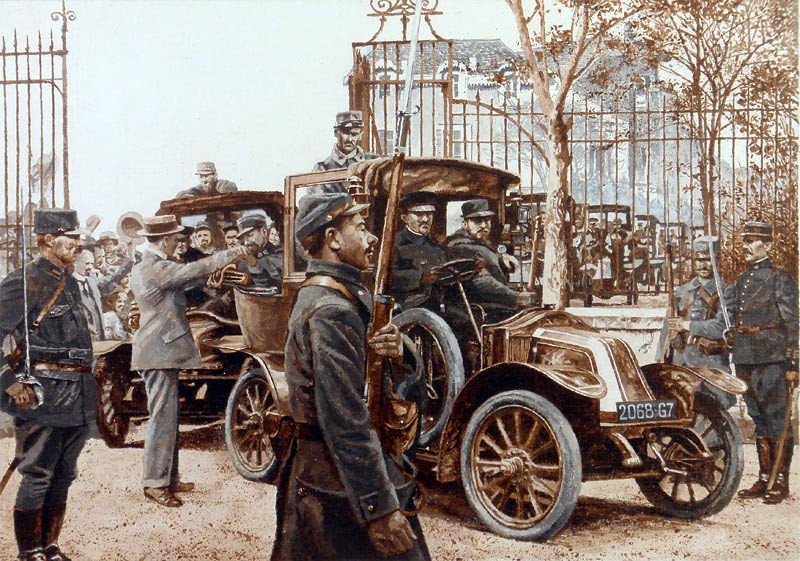
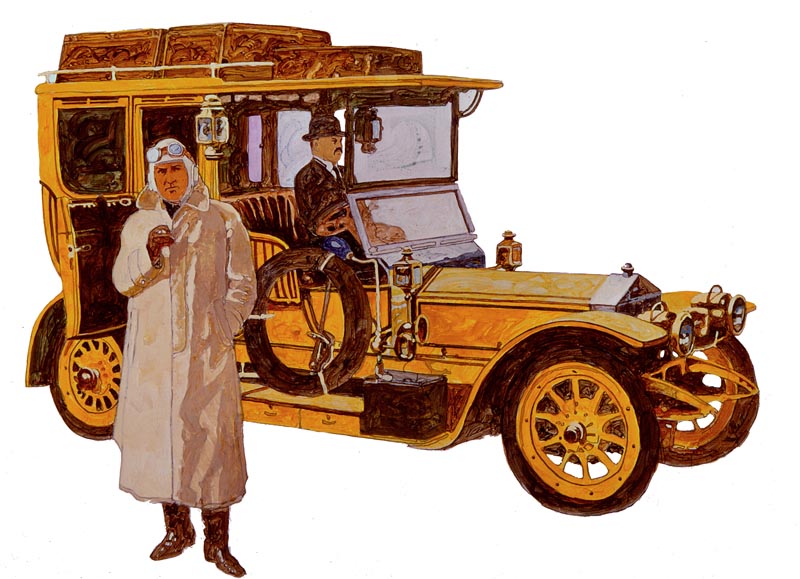
Three paintings from Man and the Automobile published in France as L’Homme et L’Automobile. All three were painted in acrylics.
Taxis of the Marne.
General Galieni requisitioned the Renault taxis of Paris to take troops to the front in 1914.
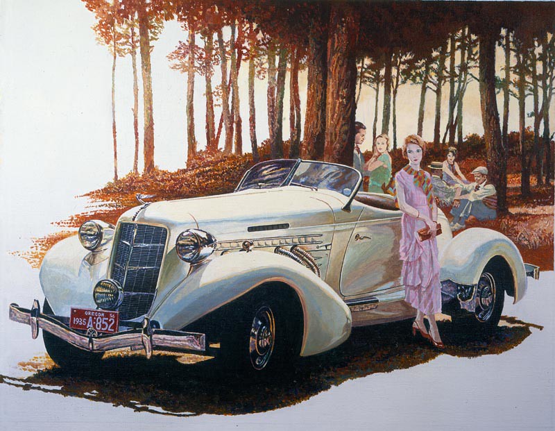
The Auburn
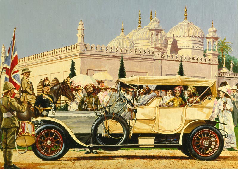
Rolls Royce Silver Ghost
Below, illustration for the first part of a serial for Woman magazine...
... and the final part of the same serial. It was rare for a complete serial to be in full colour throughout.
An illustration for Readers Digest - this time for their special books series. There were four other watercolours made for this story.
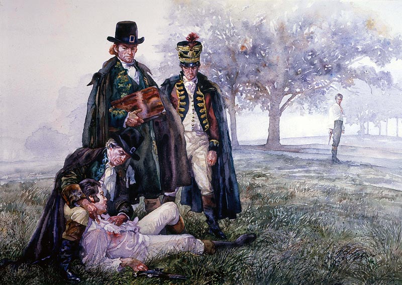
Article on duelling for Men Only. Brian visited London’s Hampstead Heath at dawn for the scene described by the author. As the mist cleared he saw a hawk swoop and take a pigeon.
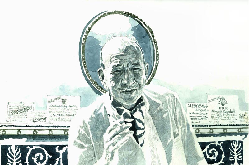
Noel Coward for Nova, the magazine most illustrators wished to work for. One of twenty illustrations showing famous peoples’ foibles.
Coward ostentatiously left invitations on his mantelpiece marked either “accept” or “decline”. When Brian’s agent delivered the drawings, the then young art director David Hillman said: “some of these oldies can still turn it on.”
Brian was thirty-two.
The early colour supplements produced in Britain gave illustrators excellent shop windows for their work.
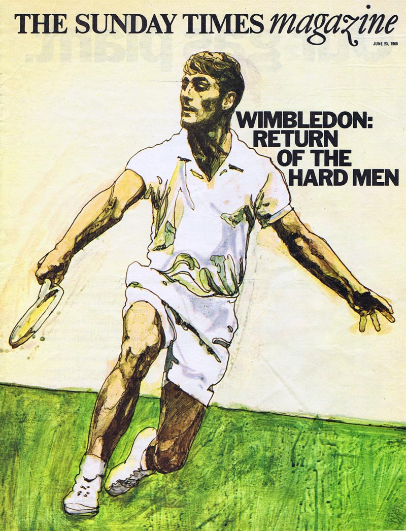
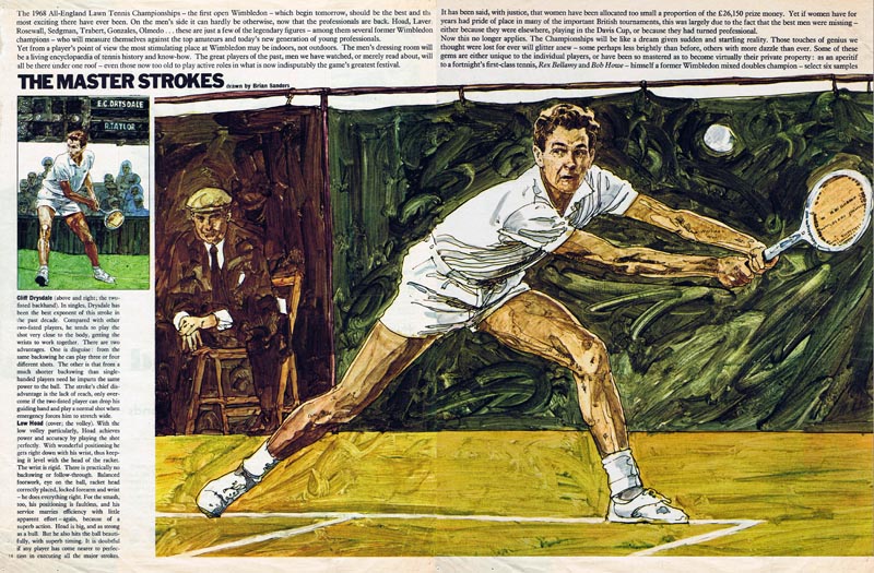
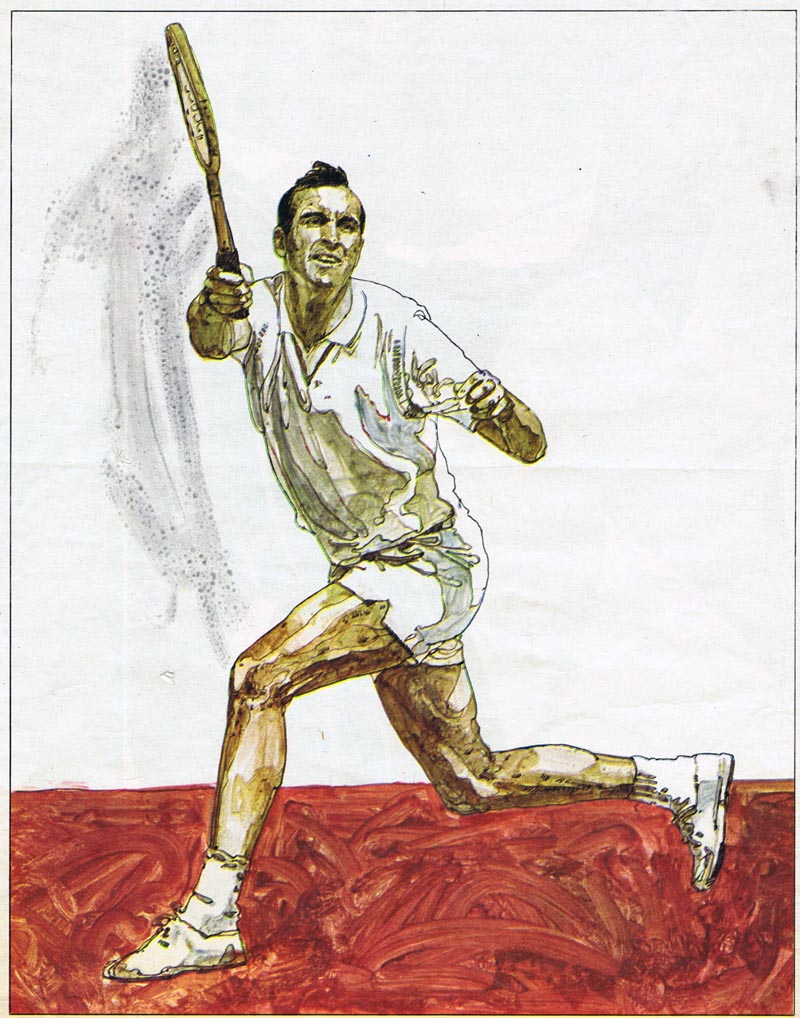
This series, in the prestigious Sunday Times Magazine featured the best shots made by ten great tennis players. The art director was Michael Rand.
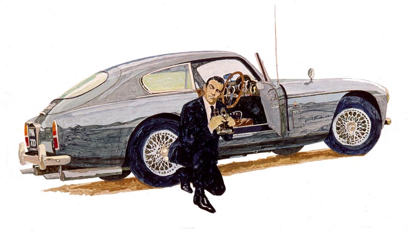
Michael Rand also commissioned Brian to paint a series of cars used in fiction. The Aston Martin used in Ian Fleming's James Bond book was an MK3, rather than the DB4 used in the film. Brian used his own Aston Martin DB3 for the illustration.
Artist/Illustrator Roger Coleman, an old friend of Brian’s – they shared a studio at Artist Partners – kindly portrayed Goldfinger for this illustration below.
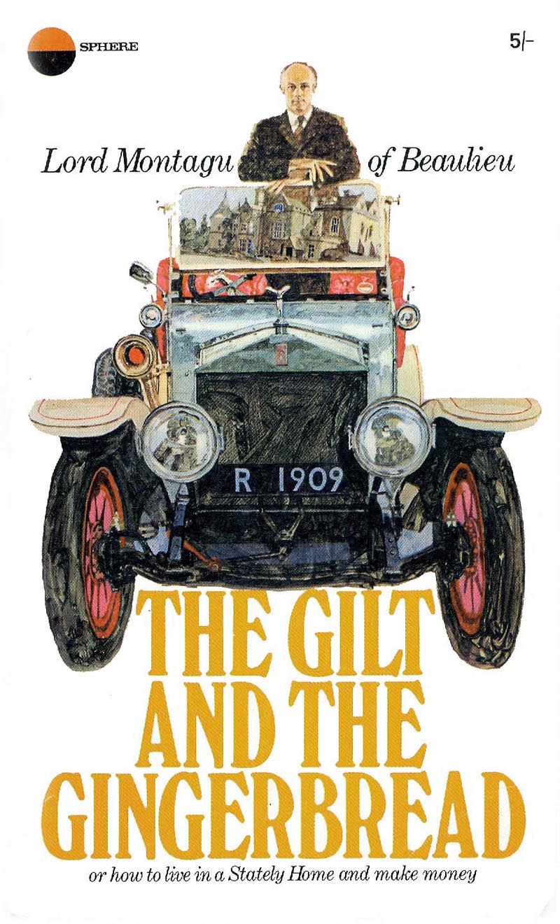
The series led to Brian being commissioned to paint the illustration for the book cover shown below. I especially liked the way Brian used the windscreen to show Lord Montagu's house, Beaulieu Abbey, as a reflection.
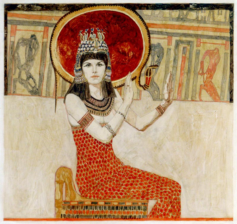
Below, this painting of Cleopatra, together with a painting of Ophelia, were commissioned as Shakespeare for Schools posters, published by The Sunday Times.
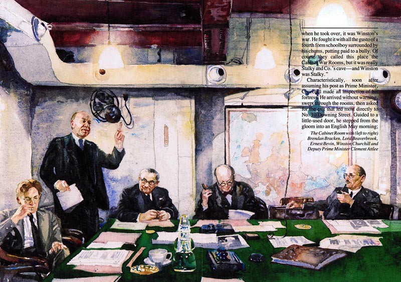
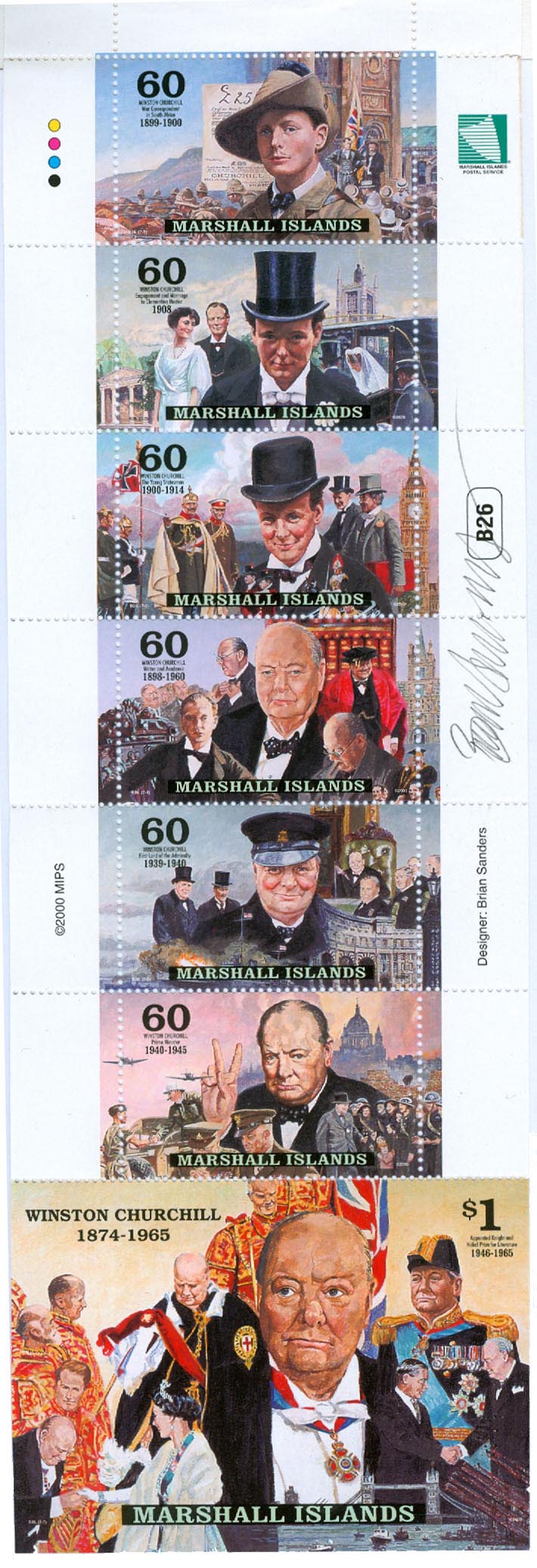
Two of four watercolours for a Readers Digest article about the British government’s cabinet war rooms. The brief was to construct a scene to include the war cabinet. Left to right are: Brendan Bracken, Lord Beaverbrook, Ernest Bevan, Winston Churchill and Clement Attlee.
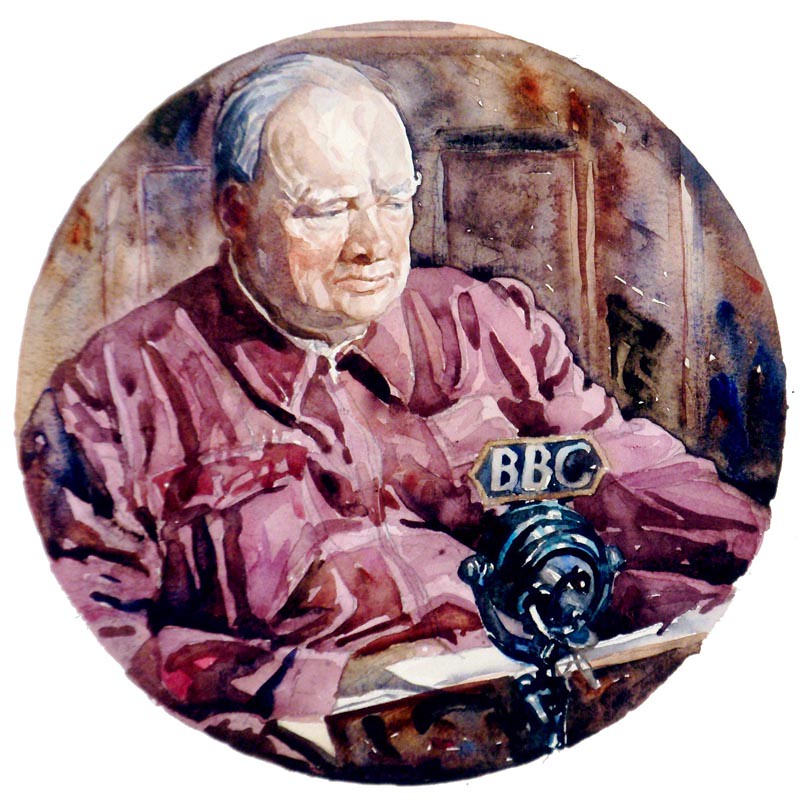
Below: Winston Churchill
Escape from Arnhem for The Sunday Times. The Dutch Resistance hid the survivors of the Arnhem parachute drop and battle, dressing them in civilian clothes, hiding their uniforms and weapons. One night they were all brought together, and re-kitted before escaping across the Neder Rhine. Art director Michael Rand’s brief was: “imagine the fear of being caught by the enemy with your pants down”.
Stamps and Coins
The Royal Mail’s commissioning art director Stuart Rose had seen Brian’s watercolour work in several magazines, and asked to see his portfolio. Brian's first Royal Mail set: ‘Police’ was begun in 1978 and published in 1979.
(Above: River Police Thames Patrol Launch.)
At the first meeting Brian was surprised to learn that he was expected to work only four times larger than a printed stamp, which was approximately 5 x 4 inches. Most of Brian’s work was large in scale, made to reduce to page or double spread magazine format. However, he took up the challenge, soon learning that good composition works at any size, but inevitably, at that size, the artwork becomes tighter.
(Above: Mounted Woman Police Constable.)
Having spent several weeks researching with the police on streets, motorways and river patrols, so he could produce a series of working drawings, he nearly lost the commission at the presentation stage by declining the Metropolitan Police’s request to replace the mounted policewoman (above) with a man. His small show of feminist solidarity might well have altered his career prospects, for in those days there was always a three-way competition for each set of British stamps. However, the art director’s assistant, Barry Robinson, smoothed ruffled feathers; steered the work through the large stamp selection committee, and the set was chosen. Their working friendship lasted over the years until Barry retired.
For his second set featuring ‘The Fishing Industry’ in 1981, Brian toured the coast of Britain where he discovered an industry in decline, but met many entertaining characters, particularly in north west Scotland.
(Above: Scottish Crab and Lobster Fishing, below: Seine Netting)
Brian thinks that his third set illustrating ‘Youth Movements’, made in 1982, was the first time he designed four stamps that worked well as a set.
(Above: Essays approved by HM Queen, below: Girls Life Brigade original art work)
His fourth set for the ‘British Council’ which he produced in 1984, was designed by the Newell and Sorrel Design Group, with Brian executing the final artwork.
In 1985, Brian went from the miniature to making a watercolour of HM Queen’s presentation of new standards to the Royal Tank Regiment then stationed in West Germany, which measured six feet by four feet.
(Below: the half size study of that painting, previously featured on Today’s Inspiration in December 2011)
In the same year he prepared in small scale ‘The Royal Air Force’ stamps, which were published in 1986.
(Above: original art of Lord Trenchard founder of The Royal Air Force. Below: Air Marshal Lord Dowding Chief of the Air Staff Fighter Command during the Battle of Britain)
(Below: Air Marshal Lord Tedder with Typhoon Fighter Bomber)
"Stamps here in the UK were very well paid," says Brian. "We were paid by the Post Office to produce the presentation set in competition and if it was accepted the fee doubled. It was certainly much better paid than editorial illustration."
1987 saw the publication of a set for Guernsey Post Office (below) featuring Guernsey born Sir Edmund Andros, who later became Governor of Virginia, Boston, and New Amsterdam—before it was renamed New York.
"I was never given another project from Guernsey," says Brian. "I had dared tell another Illustrator (Eric Stemp) how much I had been paid. He rang the client to ask why he had received less."
He continues, "The early stamp commissions came at a time when there was no shortage of work for me in other areas such as magazine illustration, packaging and book jackets, which is why I wasn't really worried about losing the Guernsey commission. I have never suffered insecurities felt by many illustrators, as I have never not had work. This is because over the years I continually experimented or changed in an attempt to do the sort of work I wished to."
Brian says, "Having Unicover USA ask me to design first day covers to my British stamps was a big surprise. The covers (one example below) paid the same as a British stamp."
Having made first day cover cachets to all of his Royal Mail stamps for Unicover USA, the corporation went on to commission Brian in 1988 to work on a fifty-year anniversary project ‘The History of World War 2 in Postage Stamps’.
It was a massive undertaking, spread over five years, and involved eight other artists.
Of the one hundred issues, Brian executed thirty-nine sets, which finally totalled eighty-two stamps.
Each artwork was designed to include not only the stamp format, but the square shape of a 1st day cover cachet for each stamp. This complicated the design, as some stamps were printed in pairs...
... or fours.
"I only ever given one change from Unicover," says Brian, "and that was to show The Admiral Graf Spey un-sunk. They paid me to redo it. All of the content other than the subject matter was left to me. The ideal client."
Later his artwork was exhibited at The Imperial War Museum Cambridge in eastern England.
During 1997and 1998 Brian designed a further twenty-six stamps and thirty-two coins for the Marshal Islands commissioned by Unicover on the subject of ‘Legendary Fighting Ships’. Eight coins were minted as a separate set entitled ‘Legendary Fighting Ships of the US Navy’.
Regarding the obviously substantial amount of research involved in preparing for an undertaking like yesterday's 'History of WWII' or today's 'Legendary Fighting Ships', Brian says, "In the case of WW2, I knew the itinerary for the year ahead and so was able to plan for the research, which was the most time consuming part, as it was pre-online and involved traveling to the various museums."
"Once I had made good contacts at places such as The Imperial War Museum, Greenwich Maritime Museum, The Fleet Air Arm Museum etc; things speeded up. The RAF Museum had already been most helpful because of the earlier stamps and having those under my belt opened other doors more easily. Not all academics are generous with their time."
To receive a commission for the design of a coin is a rare privilege most illustrators will never experience. When asked how it felt to receive such a commission - and then to actually hold the physical manifestation of that design, rendered in shining metal, Brian says, "It felt great on both counts. The first of the $50 silver proof coins were sent by airmail. The postman used to come very early in the morning in those days and so as not to disturb us left them on the doorstep!"
Brian feels he was well inclined to the subject matter of ‘Legendary Fighting Ships’. "The military and maritime section of our library (my wife, Lizzie is also an illustrator although currently reading for a masters in history at Kings College) is somewhat top heavy."
Regarding his masterful rendering of the ocean, in all it's seemingly endless permutations, Brian says, "We all learn from others and there are plenty of better painters of the sea than myself, from the 18th century forwards. I suppose that if I had to pick one, it would be Thomas Somerscales."
"I have always been a water watcher though," says Brian.
He continues, "National Service as a Royal Marines Commando gave me opportunities to view it close up from canoes...
"... and landing craft... "
" ...or the bigger ships such as aircraft carriers."
"The seascape from the decks of assault ships HMS Reggio and Striker in gale force winds remains with me to this day."
Brian says, "I have had many comments of interest from collectors, mostly favourable - some peculiar. E.G. A Dutch collector collected only stamps with Windmills on them and wasn't sure, because of the size, whether the Brederode stamp/coin had one. I was able to reassure him there were at least two."
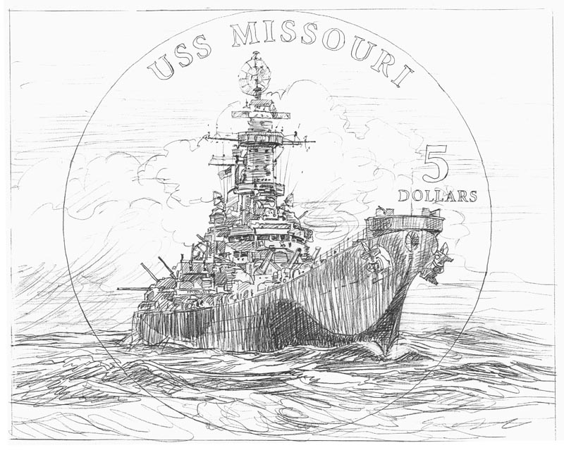
"Another gentleman queried the layout of Missouri's armament. Details from 'The U.S.S. Missouri' - a wonderful book about the ship written by her Master at Arms - proved the point."
One wonders if such massive illustration projects leave room for other commissions. In his case, Brian says, "I did manage a couple of other small commissions, but soon found that the Unicover projects were sufficient to handle and stopped accepting other work."
Does Brian consider his stamp and coin series to be the highlight of his long and storied career? "No," says the artist, "but working with Kubrick, the colour supplements of 'The Sunday Times', Telegraph' and 'Observer' gave great pleasure and a super shop window. Publication in 'Nova' magazine was a memorable pinnacle."
"Stamps opened new doors."
In 2005, The Marshal Islands also re-issued ‘Historic Fighting Ships’, and two sets from the World War 2 series.*
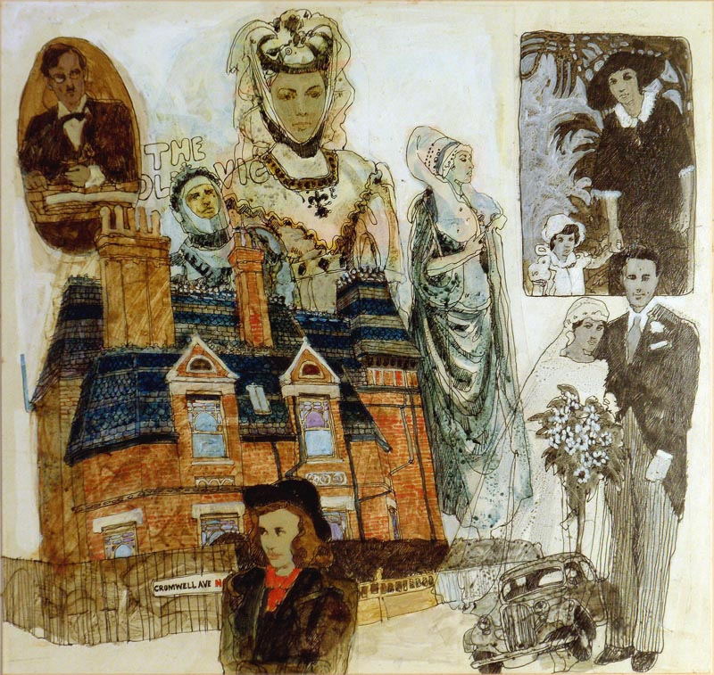
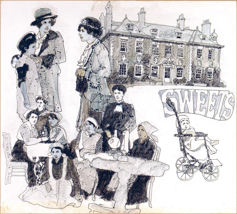
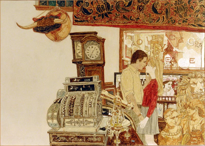
During World War Two Brian, together with thousands of other children living in London, was evacuated to the countryside to protect them from Hitler’s bombing campaign, and Brian was sent to Saffron Walden, a charming market town in north Essex, where he and Lizzie now live nearby in an Elizabethan house.
His most recently published book is: Evacuee: A Wartime Childhood, the first in a biographic trilogy. It quotes him as saying; “I always wanted to be an artist and I’m still trying”.
It is a brilliantly written and illustrated book, evoking the atmosphere of wartime Britain. I was also a child at the time, living in a different part of Essex from Brian, and his book brought back so many memories of a strange and threatening time, but also a time of great joy and fascination. The adult view at the time was that the American GIs were “Overpaid, oversexed and over here”, and indeed many of them were a source of interest to many of the young British females. They were definitely of interest to many of us young boys with their stories of life in America and in the US forces; their chewing gum and chocolate were pretty good as well!
At 73 years-of-age Brian still works as hard as he did back in the 1970s and ’80s. It’s always a pleasure to visit him and his wife Lizzie, also an illustrator; I still find their work as exciting as I did all those years ago. ~ Bryn Havord